Blogging since 2006 on learning technologies, custom elearning, instructional design and more from Kineo's Senior Solution Consultant.
Wednesday, November 30, 2011
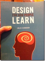
Design for How People Learn by Julie Dirksen @usablelearning
Julie Dirksen has written a most excellent book for the beginning practitioner as well as the seasoned veteran of instructional design: Design for How People Learn.
She explains theory in easy-to-understand terms, provides lots of examples and real world situations to help you see how you can apply the principles she's talking about to your elearning programs.
I'm buying this for my design team and will recommend this to clients as an essential book for their learning design libraries.
Best part is she writes in a real, human voice – very accessible. Like you’re sitting down with her having coffee and talking about her passion. And you actually understand what she’s talking about.
(On a side note and what really blows my mind: I hung out with Julie a bit at a conference in May in Orlando and she was talking about this book she was about to start writing…Clearly, Julie wrote her heart out this summer. I’m sure there was great effort involved, but it does seem as if this knowledge just flowed from her brain right into a published book.)
Wednesday, November 23, 2011
Thanks!
I'm incredibly thankful to be a part of the Kineo team and to have the opportunity to work with some truly fabulous people. I'm proud of the work we do and happy that we all push each other to do better work every day. Thanks!
I'm thankful for my creative and excellent clients, without you there'd be no point. Thanks!
I'm thankful for my fantastic PLN: passionate and committed learning professionals on Twitter and Facebook who teach me something every day and make me laugh even more. Thanks!
I'm thankful for all the industry smarty pants who write books and articles and blog posts that expand my thinking and move me in new directions. Thanks!
I'm thankful for the opportunities I've had to speak and write this year with organizations like the Elearning Guild, ASTD, HR.com, PMI and Elearn Magazine. You all make me better Thanks!
I'm thankful for cool technology that lets me write a blog post while standing next to the stove while I prepare to bake the annual pecan encrusted sweet potato pie! I'm thankful for my blog and I'm thankful for those of you who actually read it and comment here and inspire me. Thanks!
I'm thankful for my kids who host things like drawing club on weekday nights so I can scribble around and draw hand turkeys. You help me tap my creativity and push my patience and fill me with love. Thanks!
And now to that pie baking...
Tuesday, November 22, 2011
Mirror, Mirror: elearning that shines from the inside….
“Mirror, mirror on the wall, who is learning here at all?”
We’ve all seen a lot of elearning fall flat for a lot of reasons, but one of the biggest reasons is that it’s often simply used as a vehicle in which to dump impersonal information. Are you in the e-learning at all? To paraphrase Lionel Ritchie (something you should do very carefully): Hello – is it you you’re looking for?
Read more of the latest Kineo top tip: Tip 61: Making it Shine from the Inside - Reflection Counts
Wednesday, November 16, 2011
Veterans Affairs Learning University at Corporate University Week
Alice Muellerweiss, Dean at Veterans Affairs Learning University
Trained 200,000 in the first 9 months of the learning organization. Veterans Affairs Learning University (VALU) started in 2008ish…
Support over 20,000 Veterans
Strengthen the way we serve veterans by employing more veterans – Recruit, Retain, Reintegrate our Veterans
VA for Vets program: goal is 40% Veterans working within VA
Diverse mission (still serving two family members from the Civil War!)
Mission to transform the VA to a 21st Century Org. We had antiquated systems and processes. Had a staff of 16 – had to hire in a leadership team…
16 initiatives from healthcare to backlog to human capital.
People will make the mission. Taking care of people is about developing them.
Had three stovepipes: Health, Benefits and Memorial Affairs
Created competencies, measurement, lots and lots of activities…
Don’t have a brick and mortar…people go to training on their site (more convenient for student).
When do bring in sr. execs use other people’s infrastructure (hotels) – to save money, to stay agile
10% training is f2f; 90% is online.
MyCareer at VA – just rolled out this portal. employees can see and chart their path for development. Tools to determine if they’re fit for a particular job.
In the military, you have a path…from private to general.
People leave their organizations for two reasons: their supervisor, lack of career development.
Reginald Vance, was IT initiative lead – became Director of Learning Infrastructure at VA
Human Capital Investment Plan (HCIP) – 4-5 projects identified (these pulled out to 22 projects that needed to be managed)
VA LMS was one of the first and last projects on that list.
Wanted it to be as easy as buying books online.
MyCareer at VA: Prepare, Explore, Plan, Develop – employees go into system and assess themselves to see where they are, start looking at jobs at the next level. This system just launched.
To be competent in your job to better serve our Veterans.
Providing competency model for employees, giving a career mapping tool – from an LMS to a full Talent Management System – no one else was doing this in Federal govt.
The old LMS – no one liked. Hard to log in, hard to pull records.
Went out and asked stakeholders what they needed, what they liked/didn’t like about system. We scrubbed everything and went back to the drawing board.
Use Plateau SaaS model as the TMS.
Serve 350,000 VA employees. Serve additional contractors.
Have since delivered millions of training instances…
- Simplified reg/login process
- When first login in – you see a To Do list
- Some courses are self-assigned
- Using video vignettes 3 or 7 or 15 minute-ish videos for just-in-time…
- Tool helps supervisors walk through conversations with employees
- www.mycareeratva.com (go check it out and use some of the tools – this stuff is public and anyone can use it).
- Shows you where the jobs are located –
- Shows what the future of specific jobs is (e.g., in one year it’s not going to be needed), so it’s got some forecasting capabilities
- Outward facing and inward facing elements of the system.
At the VA, we have to defend every penny. VA got a ton of money for people development. Working hard to measure the impact.
In two years of investment seeing a pos return of 17% (learner gain on pre and post testing) – but some things have just launched so haven’t started measuring yet.
Seeing a difference in the field in the care our Veterans are getting, customer service…
The Secret Sauce
Having the champion – the senior most champion you can have (Veterans Affairs Secretary Shinseki)
The autonomy for vision (they were given an initiative and then had the autonomy to deliver on that)
Hiring terrific leaders – and empower them to get the job done. Hold them accountable.
The funding
Accountability (Dean Muellerweiss reports weekly and monthly on numbers)
Now have 60+ people on her team – growing to 73; a number of vendor partners; lots of learning leaders across VA (they don’t report to Dean – they help get training to the field);
Initially had to outsource a lot of their training function now looking to bring some of this back in.
Secret sauce:
where strategy fails: when the strategy is developed by one person and handed off. Have to develop it together.
For the VA – it’s been time critical to launch the portal – if it’s not integrated into the fabric of the VA it could go away with the next political appointment.
Note: later in the afternoon, the VA team won the award at CU Week for best new corporate university.
Developing and Marketing your Learning and Organizational Development Brand at Corporate University Week
My live blogged notes from Corporate University Week.
Developing and Marketing your Learning and Organizational Development Brand
Judy Whitcomb SPHR
Chief Learning Officer, Vice President, Human Resources and Learning and Organizational Development
Vi (formerly Classic Residence by Hyatt)
She started off sharing stories about their organization.
Start with an analysis of how the learning brand is being perceived within your organization. Then figure out where you want to go and what you want to do? Identify 5-6 key words that you want to use to identify your brand within the org.
They started off with the perception that the learning org was a bit difficult…
Learning materials and LMS strongly aligned with their visual brand…
Keys to a successful marketing plan:
- recognize that emotions are powerful communication tools
- engage senior leaders in telling the story
- involve cross-functional leaders to be advocates
- repetition, repetition, repetition
- leverage your business policies
- Recognize how learning will support practices, etc.
Tent cards, emails – what’s new
Ongoing webinars to train and promote features and benefits (don’t turn on allt he features of your LMS right away – let people get used to it
Recognize results
Target learning strategy with specific needs that employees have (“how do I write a better marketing plan?”)
Company newsletters
Linking Succession Planning with Current and Future Biz Needs: Jill Zimmerman at Corporate U Week
My live blogged notes from morning session at Corporate University week.
Linking Succession Planning with Current and Future Business Needs – Talent Review Process Excellence
Jill Zimmerman
Vice President of Talent Acquisition and Development, Human Resources
Discover Financial Services
About Discover
- Discover = started in 1986; leading credit card issuer, over 50 million card members; also in personal lending and direct banking.
- Vision: “To the be the most rewarding relationship consumers and business have with a financial services company.”
- Mission: to help people achieve better financial future
Succession Planning
- Process
- Tools
- Key success factors
Key success factor #1: always start with a bus strategy. Proactively build a robust talent pipeline to meet future bus and succession needs.
Key success factor #2: keep both the job and the people in mind. Do we have the right jobs to meet the needs? Do we have the right people?
Key success factor #3: use a common set of metrics. At Discover, set of leadership behaviors that apply to everyone at the company.
9 box…
Have a job scorecard – what skills are required for a job? what leadership skills are required for that job? do you have a successor for that job? is there backfill for that successor? (if there’s not a deep bench, you may have to go outside the company).
Have a people scorecard (focus on the people) – create an accurate depiction of the people. What business skills? What leaderhip skills? What do we need to do with this person? identify individual gaps.
Key success factor #4: development must be on-going.
70/20/10 model:
- 70% experiential – things people can practice and do on the job
- 20% learn from others – mentors, coaches, managers, role models
- 10% learn on own – classes, articles, books
People usually identify that 10% – but we need to get better at identifying the 70%
Key success #5: CEO/COO must be active owners
Ongoing mindset; dedicated time; trusting and transparent discussion; accountability
Create a Candidate Slate
How will you know if you’re successful?
- Retention
- Engagement
- Internal Mobility
When people feel there’s opportunity, movement and growth – they’re more engaged. (They do anonymous surveys that is tied back to other data so they can see who’s staying, who’s transferred and who’s more engaged).
Retain and engage your most critical resources.
What are people good at? What are they interested in? What business needs can they meet?
Have done exit surveys – 3 years ago #1 reason people were leaving was internal mobility. Today’s it’s other reasons like relocation…
Tuesday, November 15, 2011
Leveraging Technology to Drive Business Value (University of Farmers) at Corporate University Week
My live blogged notes from today’s closing session at Corporate University Week.
Leveraging Technology to Drive Business Value
Art Dobrucki, CPCU
Director of Learning Strategy & Performance
University of Farmers- Farmers Insurance Group of Companies
Start with the end result in mind. What model do you use in your org? At its heart does it have business value?
Create a technology roadmap for learning: What technology solutions will help people do their jobs better? lay that over the technology solutions you have. Figure out where you want to go.
Some things they’re doing at U of Farmers…
Making use of video – they now have a video studio – think breaking news stories with experts to keep employees informed about a current crisis (Farmers = insurance company). Then repurposing these videos in the LMS, for mobile, etc.
Audience Response systems
Using iPads with video to record roleplays and then review them with instructors.
Have two brick and mortar university facilities. (19 classrooms, offices, webinar rooms, assessment center, media studios, learning labs – cars to get under and look at damage, houses to explore)
Seven years ago he had a department of seven. Had a huge issue with retention –alarm bells were going off. Needed to develop and retain talent. Demonstrated that learning was able to drive results that the company was looking for with agents. Built on that success. Start demonstrating business value to get the investment…
A learning portal
Reskinned their learning portfolio – there are pathways to go depending on whether you’re new employee, on a leadership path, etc. RSS feeds.
Mapped competencies to make it easier for people to find resources. (14 leadership competencies that applied to everyone; 28 additional core competencies).
So click on “Coaching” or “Negotiating” – go to a page with definitions, self-assessments (what’s my level of competency), then direct people to resources: books, courses, recommended experiential activities (what conversations should I be having? what should I be doing?)
Are your portals just a gateway to your LMS or have you mapped your content and resources to help employees find what they need to master particular competencies?
Engaging learners in the moment of need
Think about the trends in the marketplace
Think performance support!
Capability Readiness for a Changing Workforce
Mobile and tablet devices.
Don’t put courses on them – but information you need to know at the point in time (e.g., about to go make a sales call at a dry cleaners – top five questions to ask)
As new devices come out – buy one or two for your department and bring them in house so people on your design team can start playing with them.
At Farmers, starting doing podcasts when iphones started coming out – found out not a lot of demand for that – so now using those skills in video…keep experimenting and see what works for your organization’s needs.
$100K per year on training binders – instead put those guides onto iPads that they use for the training week. Can take notes and annotate the guides and then send them to yourself at the end of the week. Training dept refreshes the ipad at the end of the week.
Using videos to assess sales skills – video gets uploaded to a server and the certified teachers evaluate the skills.
Remember that you can’t always hit home runs. If you say everything’s a home run, you’re going to start losing credibility. (Start measuring!)
Allison Anderson Learning Together at Intel at Corporate U Week
My live blogged notes from CU Week. @allisonanderson
Learning Together: How Intel’s Learning Community of Practice Role Models “New” Learning with Allison Anderson
50+learning orgs at Intel – well over 650 people taking care of learning…Most people don’t have learning or training in their titles…hard to say exactly how many.
Highly diverse population – lots of people with lots of different needs.
No CLO – completely decentralized. We like having learning orgs distributed close to the business. (do have senior managers in learning positions)
And very global.
With such a decentralized model, the rely heavily on Communities of Practice (a comm of people who are working on something similiar, similar work tasks…)
Why a COP? “overcome the inherent problems of a slow-moving traditional hierarchy in a fast-moving virtual economy.”
LCOP (Learning Community of Practice) is their COP of learning people from around the org. In 1999 there were three people…today over 400 people involved.
Keys to success (what has helped this community thrive?)
- Purpose & Identity having a very specific purpose will help you.
Today’s Learning Community at Intel – to increase our own performance to have a greater impact on employees at Intel.
Have a clear mission and goals and review it regularly. - Articulate Business Value
“my metric is people are engaged and participate” – do I track this back to a metric? Nope…not to say that you can’t find relevant metrics. - Content & Engagement
LCOP meets once a month – do peer presentations. Hear what happens in other learning groups across Intel. These are virtual/online. Maybe 35 people for these meetings – people can decide what topics appeal to them?
Internal conferences. Usually F2F but sometimes virtual.
Like to bring in external speakers – internal people don’t get to get out too much – they enjoy hearing from outside colleagues.
Do lots of synch and asych dialog.
The use a social computing tool – called planet blue
People are more than robots who go to work every day – we’re people – it’s ok to have fun, too!
What does engagement look like? (She shows a screenshot of a whiteboard from a webinar session) – 35 people online at the same time typing on the screen at once. It even engages the introverts—you get a lot more dialog going. - Leadership & Support Needs a good community leader – someone who’s dedicated and passionate. You need to have a thoughtful guide, beacon, evangelist—this helps to build and maintain a successful online presence.
Corporate University Week: Leveraging Learning to Engage Employees and Foster Culture at BMO
Second presentation as part of the Corporate University Week opening session. These are my live blogged notes.
Barbara Dirks
Chief Learning Officer Institute for Learning
BMO Financial Group (1600+ branches in North America) Bank of Montreal…
Vision: To be the bank that defines great customer experience.
Starbucks, Disney, – they have a unifying vision.
L&D function is now more strategic part of the organization.
World class corporate university in Toronto. Also a CU in Milwaukee area. Plus satellite locations. “The Institute for Learning” – established in 1994. Originally a more supply-based organization. Over the past three years become far more connected to the business.
Employee Engagement
Employees spend about 6.2 days a year on learning.
What is employee engagement and why does it matter?
Say….Stay…Strive
speaking positively about the org…intense desire to be a member of that org…to contribute to the business
How do we design/dev learner that drives engagement?
Four key focus areas:
- Orientation and new hires – to cement relationships with new ees. Inspire engagement and make people feel welcome. How do you fit into the big picture. Research shows that those orgs that spend the most on orientation have highest levels of engagement.
Shows elearning menu which is a blueprint of the organization. Different “rooms” in the building – can’t move from room to room until you’ve viewed all of the videos, etc. in each room. CEO’s vision, etc. Launched through the LMS so they can track that people have done it.
In addition to general orientation, provide role orientation (e.g., branch manager curriculum) – takes 7 months to be role ready to be a branch manager… - Leadership Development
Starts with orientation. Very deliberate in development of program – senior leaders. Mandatory thing – 1.5 day senior leadership orientation.
Need strong leaders to drive engagement of employees.
3 phase leadership curriculum: first time managers, for managers of managers, for executives.
3 days in a classroom setting followed by the on the job practicum…over 6-18 months.
Won an ASTD BEST Award for this program. - Customer-Focused
It’s important that employees should care that a company/customer is doing well financially. Bring the voice of the customer into the classroom – big impact. Through videos, audio…Developing a course now on understanding our customers – to make a better connection for those in the back office – their role in the ecosystem of the customer experience. - Blended Learning
Supplements to in-class learning – videocasts, podcasts, webinars, social learning – want to be able to deliver learning anytime, anywhere.
***
Annual employee surveys show positive trends.
Collaboration is also a key theme. How people work together for the vision to succeed. That collab starts at the top.
What does leadership mean? It means being with people. It’s reinforcing the vision. It’s dialog. It starts at the top – the CEO role models this.
Also do a number of internal conferences for the 5000 managers of people.
Merged three organizations and had to merge cultures.
They do a lot of work with Root Learning to create “learning maps”.
Discussion about how to measure the success of learning – she says so much of it is intangible (in discussing their orientation program on vision/culture)…
Corporate University Week Opening Keynote: Verizon Wireless & Bellevue U Collaboration
I’m at IQPC’s Corporate University Week in Orlando, Florida. Unlike the typical elearning conferences I go to where we’re talking a lot about practice, this one is focused at a more strategic level. Leadership is the word.
It’s small and cozy – about 16 vendors (of which we’re one) – and about 150 attendees. I’m looking forward to some really substantive conversations!
These are my live blogged notes from the opening session.
Michael E. Echols, Ph.D.
Executive Vice President, Strategic Initiatives and the Human Capital Lab
Bellevue University (www.humancapitallab.org)
General theme of the conference: linking learning outcomes to business objectives.
In the past, we’ve looked backward and heavily valued ROI…ROI looks backwards at a financial parameter – but there’s a lot more involved in business outcomes.
If you look at biz objectives – mobility, recruiting, retention are also factors.
The ROI conversation is dead. It’s backward looking and exclusive to financial.
Think about business outcomes in a broader perspective.
Risk management is a big priority in today’s economy. What does risk mean in learning community? Classic HR parameter of retention is a risk parameter. If you want to talk about your impact—growth and risk – you have a direct impact on risk in your org. The risk is that you invest in your people (your human capital) and they leave. Retention and turnover is a risk parameter.
Good ideas – that’s what’s in short supply (not cash). In the US economy, cash is not the scarce resource. Your companies need to have good ideas – and you need to help connect those good ideas to business outcomes.
Bellevue University and Verizon Wireless Collaborative Effort – Case Study – “How to Leverage University Partnerships Within Your Organization” Dorothy Martin with Verizon Wireless
Three years ago the concept: a collaboration between a university and a corporation.
linking tuition assistance to talent management
Professional 12 course program over two years that leads to a bachelor’s degree – focus on retail. It’s funded through Verizon’s LearningLINK program. Professional Retail Sales & Management program (PRSM)
Goals: pos impact on biz outcomes, reduce turnover, increase mobility, connect retail employees across US…
Three key elements: co-designed curriculum, co-branded communication (a concerted internal marketing effort), measurement
Where is it today? Business results and lessons learned
1. Curriculum Dev
Curric dev took one year for the 12 courses. It focuses on retail industry from universal and contextualized (verizon specific) perspectives – learn general and how it’s applied at verizon.
Ended up with 45 Verizon Wireless SMEs. (retail store managers, district managers, vps, etc.)
2. Co-branded Comms
Brochures/ecards went out to 2,400 retail stores. Management and employee webinars. Created a co-branded web portal to get more details and how to enroll.
Lots of participation from sales/marketing (86%)
1,147 participants to date. 60% retention rate. Graduated over 200 participants so far. 97% of grads have STAYED in the business.
3. Measure
Study on the PRSM program and the business impact. (multi-variant comparative study – sample size over 150 with a comparison group).
- 23% higher performing rating (than those who didn’t go through PRSM)
- 50% higher Leading rating
- more likely to have received a promotion
- significant increase in sales revenues for those who went through program
- They sold more goods!
Verizon is now working with Bellevue on a second program direction at Call Center Operations & Management.
Now doing a new study – looking at the value of hiring someone with a degree vs. someone who was hired without a degree and given the opportunity to get a degree.
Looking at taking this beyond the Wireless division to other areas across the enterprise.
Senior Mngt continues to invest.
20% of employees are using LearningLINK (their tuition assistance program) – compared to the national average of 5%. Sr. Mngt really understands the value of this and supports promoting these programs.
“Context accelerates learning”
The PRSM program is a dialog, collaborative cohort model. 100% online.
Sunday, November 06, 2011
Avoiding the Trap of Clicky-Clicky Bling-Bling #devlearn
It was a great session – lots of conversation with the group which you won’t see on the slides, a few side bars and tangents, and some free t-shirts at the end! Thanks to everyone who joined in.
And for the record -- I designed my slides to match the t-shirt I was wearing ;)
Tom Crawford: Design for Mobile The Ups and Downs of the Small Screen #devlearn @vizchef
My live blogged notes from Tom Crawford, @vizchef, @viznetwork session at DevLearn November 3, 2011 in Las Vegas. Forgive the typos and omissions. And also forgive the delay – forgot to publish these right after the session on Thursday!
The mobile market:
Smart phones are growing; but not-smart-phones are still significant part of the market. So you could still do SMS and text and do good stuff with mobile learning. Today we’ll talk about smart phones.
Androids are growing.
PC/laptop use is down 20%; mobile is 30% up.
The better numbers are about actual users – Yelp has 45 million users. right now only 7% of them are mobile, but 35% of searches are done on mobile.
Facebook – mobile users are 2x as active as desktop users (they post more, read more, are online longer)
Eight unique affordances of mobile:
- personal – the phone knows a lot about you – where you walked. it knows things you didn’t tell it.
- always carried (in the room EVERYONE has their phone, but most of them don’t have their laptop)
- always on
- built-in payments
- available when inspired (you have an idea or thought, you do it right then)
- accurate audience measures (incredible data – everything is tracked – when, where you sent that text; when you went online. That kind of tracking data is not available anywhere else.)
- captures context (you know where they are)
- allows augmented reality
Native Apps vs. Web Apps
native is written for a specific device.
You have to make this decision.
native apps run faster, more interesting, access more controls on the phone. However, then you have to develop for iphone, ipod, android, etc…takes a lot of time and money.
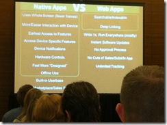
Web app runs on everything that has a web browser. Develop once and run everywhere. But doesn’t run well always and not fully featured.
Cross platform tools – unity mobile, unity, appcelerator…publish to one place and deliver to multiple devices.
Go to The Boston Globe website – the website resizes; images resizes or disappear depending on the device used. Program once and run on all devices. (they’re using a new design style – html5 and css with some javascript; also some intelligence behind it). If you’re thinking about doing mobile web apps – check out that site.
Getting started: benchmark
Look at best in class apps out there – what affordances? Flight Track Pro, SoundHound, Angry Birds, NetFlix,
Getting started: know your audience
No different from any other design. “You are not your audience”
Mobile Context – where are people using their devices? What environment are they in? Context is really important…
Are they using this on a sales call, at their desk, in a line, in a car?
If they’ll need it fast – one big button.
Design
Prepare for lots of tips..
use basic design
- no design is perfect – you can always tweak it
- every design has compromises, trade-offs and constraints – we have to make choices
- criteria for “good” design depends (LukeW calls this sharks climbing trees – in the water sharks are amazing)
- no one right answer
- no just about look, but about FEEL (does it feel responsive, like you’re learning?)
steal like an artist nothing is original – find good stuff and use it…
Content first (don’t make me login first – foodspotting – you can go find stuff immediately, you only login when you want to ask questions or upload photos, etc. get me what i need now – if i’m standing in line, get me my content otherwise by the time i’m done logging in i’m done with my line)
only ask for data/info WHEN you need it
Disappearing UI As a % of space – use it for content – minimize navigation, etc. Put content upfront and center. You can hide nav until you need it.
Edit, edit, edit cut the content to the essentials
Minimize the steps
Billboard/glance test can you look at it and get it? (period tracker app, compass app – tells you where your partner is) Billboard test – you’re going down the higway and you have 3 seconds to get it…
Clarity trumps density too much info on a screen? wasted space?
The rule of 44 your fingertip takes up about 44 x 44 pixels – buttons should fit that space (or the tap area needs to be that space). Or make it even bigger so they don’t have to think – make a giant button.
Design to a grid every object on the screen should be aligned to another object on the screen
Follow reading order in US we follow z reading order – prioritize your content
Tasteful, understated not garish
Avoid metaphor you’ve got small space, don’t waste it with interface that is bling. Content first.
Balance brands & standards follow apple standards for ios apps.
Don’t just say “Back” don’t know where i’m going back to. instead have the back arrow with text -- “full title” or “title” or “full ti…” Tell them where they’re going back to.
Follow title bar zones for apple apps follow standards. have your logo on the front page, but don’t put it on every page (netflix wastes space with their title on every page)
Don’t be too clever he shows some bathroom signs that are clever but who knows which is men’s or women’s…
Use clear standard icons
Use a consistent light source for graphics etc – you won’t know why you won’t like an app that does this, but you will
1-2 Fonts; 4 sizes nothing more and use them consistently to mean the same thing
Use visual cues like grouping
Tap zones if you’re holding your phone in your left hand there’s a zone you can reach with one hand…you can’t reach the top corner…
Use the right keyboard number, letters, etc…
Use the right capitalization make no caps
Make the form disappear TripIt is a good example. Get your flight info from delta and forward it to tripit and it pulls it all out for you. Type nothing.
Avoid scrolling where possible If you’re going to scroll, make it obvious
Beyond touch
lots of sensors now – voice, gestures, proximity, bluetooth, gps, compass, cameras, accelerometer, shake…
Augmented reality
overlay of data knowledge on an image…new employee orientation…
What was there (an app) – see what was there 100 years ago…
Word lens – live translation – while you point your camera at a sign it translates it…
Prototype & Test
Balsamiq – great prototyping tool which you can actually run on the phone. super simple way to test
“A good UI without a good UX is meaningless (and vice versa)” -- if beautiful design doesn’t work or if it works and it’s ugly…
Resources
- Tapworthy
- Desigining the iphone User Experience
- Designing Mobile Interfaces
- Designing for Emotion
- Mobile First
Thursday, November 03, 2011
Ethan Edwards: 5 Most Important Analysis Questions You’ll Ever Ask #devlearn
My live blogged notes with session with Ethan Edwards of Allen Interactions (www.alleninteractions.com).
Same issues we’re dealing with in elearning today that we were dealing with 30 years ago.
Better elearning, better processes!
ADDIE…we’ve heard of it, is it iterative? etc.
Regardless of what you do – you need analysis/backgrounding.
Challenges of design for elearning:
- instruction must stand on its own
- can’t be adjusted or fixed on the fly (when we teach classroom…”let’s skip these pages.” if we make mistakes in analysis, then the learner is stuck…)
- must account for all things instructor might do
Does your org think elearning is formatting text, decorating screens and test? (so much elearning is like scrapbooking)
We want to create experiences that will create lasting and beneficial change in the performance environment
Where does analysis go awry?
- Often it’s skipped altogether. many authoring systems don’t support design – they provide formatting options.
- Or it’s perceived that analysis is already done by SMEs. SMES view analysis as a content dump and not a dialog. documentation of content does not equal design.
- Course already exists – conversion doesn’t require analysis, right?
These are failures. We shouldn’t accept them. Often trainers are too nice! Need to tell people when it’s a bad idea.
The Five Questions
1. what do learners expect to do after completing the course that they can’t do now? The purpose of elearning can’t be to create expertise. Expertise takes years to develop. Instead we should be aiming to create minimal competence.
Ask why is this important? Create a table: on the left list content “requirements”. along the top list the performance outcomes. then put checks across the grid to identify what you really need to include. There will be rows with no checks at all.
Push back on this is “well it doesn’t hurt to put in there.” But for every page that the learner says, ah I’ll just skip this, the more likely they’ll skip everything. Don’t overstuff the elearning with unnecessary stuff! If the SME still wants it, put it in resources.
You’ll find outcomes that are desired that have no content to go with them.
Most compliance training actually does have value to your org (don’t just do it cuz you have to)
Because elearning is $ to create, there’s no reason to create it unless there’s an outcome.
Even if your main goal is knowledge (don’t think it’s possible to have knowledge objectives)
The chance of learner mastering a performance objective when there is no opportunity to practice are slim.
So how do we translate moving your cursor into something with meaning (you can point, click, type)
If what you have people do is click a, b or c – that doesn’t translate into installing a router. There’s little opp for transfer.
I have never been asked a mult choice question in my daily life. Training prepares people to answer MCQs.
2. What are consequences to the learner if they fail to master the intended outcomes?
Often the learner’s highest level goal is to get through this course quickly!
Need to provide meaningful consequences.
Artificial consequences in elearning: a failing score, a jeopardy game where you lose money (that’s not a meaningful consequence).
Risk and consequences strongest tools to create motivation and buy-in. (Remember consequences to YOU or the ORG are often different than the cons. to the LEARNER).
Understand what the learner is motivated by. Relate those consequences to the real-world environment.
If I learn through the exercise that you’re going to tell me the answer, then I don’t do the work to figure out the answer. Make the learner figure it out.
3. Can you show me an active demo, a detailed sim, or provide an opportunity to directly observe the desired performance?
The expert assumes they know – they don’t always know what’s changed, or haven’t done it in years.
Include recent learners in your analysis. They remember what they didn’t know. They are now minimally competent (our target!)
4. What specific performance mistakes do new learners usually make?
The content is often not the challenge.
5. What tools, resources, or job aids, or help do successful performers (or even experts) use to do their tasks?
Often you want to help the learner use those tools.
Interactivity shouldn’t be designed to get correctness – instead encourage lots of mistakes! We add to our knowledge when we make mistakes.
So you might need a final test to “assess” – but don’t do that throughout – the learner feels too observed. Let the learner mess around.
You want the right things to be hard. In the real world, there’s no penalty for using the employee manual. Let the learners use their manuals in the elearning!
______________________
Time now for some demos on the Allen Interactions site: http://www.alleninteractions.com/content/case-studies-and-demos
Showing an example where the exercise is to fill out a field notes 9for a copy interviewing gang members) – there’s no right or wrong, but the learner can compare their text input with an expert’s input.
Mastery is a better model – keep people working until they can prove they can do it without error.
Steve Rosenbaum – Curation Nation - #devlearn keynote
These are my live notes from DevLearn November 4, 2011 in Las Vegas.
Steve Rosenbaum (@magnify) author of Curation Nation (www.magnify.net, http://curationnation.org/)
The world is changing fast. Curation is a good news/bad news thing.
The cloud – sounds so fluffy and nice. It’s being presented as an awesome, good thing. But clouds are often gray and scary – storm clouds!
Look at what we’re trying to managing in our personal lives – it’s similar with our data lives!
30% of respondents to a survey check their email in the middle of night.
The is too much signal. There is too much noise.
We start tuning out; plugging our ears. This becomes a road block.
Between the dawn of time and 2003 we created 5 exabytes of info – we now create that much info every two days. This is a big change.
Twitter is on the path to 10 billion tweets.
It would take you 8 years to watch all of the video that was uploaded to YouTube yesterday.
The world we now live in: walking in to the library of congress and someone’s erased all the dewey decimals and moved the books around.
This just happened.
Facebook now stores 140 billion photographs. Way more than the library of congress.
The deal is – we all need to become curators.
July 2010 – the US time spent online – when it changed to open architecture where everyone is a publisher – that’s where Facebook usage starting far outstripping all the other sites.
US is only #6 on the list of countries and numbers of internet users. Nigeria is #3. Iran is #5.
We used to talk about surfing the web.
This is a problem that we collectively get to solve. Information is knowledge and learning. Unless it’s just in a big pile – then it looks like junk.
Need to make information digestible for people when and where they need it.
Say goodbye to search.
Google yourself. Look at the images and see how much of that is NOT you. (Steve says he often goes to Facebook now first to find people.)
In the last 6 months it’s just gotten harder to find things. Google is based on static links to static web pages. But that’s changed – we’re tweeting now.
Say hello to curation.
Content is king. Needs to become Curation is king.
When your network clues you into something important – thank them – they’re your curator. Don’t feel bad that you missed something.
Who in the room identifies themselves as a publisher. Publishers – when you retweet something you’re broadcasting, you’re publishing.
The #1 food magazine (Taste of Home) is published by Reader’s Digest and it’s all content submitted by readers.
In the world going forward, where there’s too much information, people need to dial stuff down. Are they dialing you down or are they dialing you in? Help them find information that matters. We live in a world where everyone need’s filters.
Humans replace algorithms.
Ideas replace data.
Human beings are not replaceable.
3 powerful ideas about curation
1. Choose your digital clothing. We make conscious choices about the clothes we put on in the morning. We need to make conscious choices about our digital. Rosenbaum reads 450 tweets a day – and RTs about 3-5 of those. He filters his subject so we don’t need to read those 450.
On Foursquare you check in and tell people you’re going to a cool movie but not that you’re at the dry cleaner. Be conscious.
2. Listening. Listening is more powerful than speaking. I can scan faster and pull out the important info more quickly than a computer.
3. Tools. Try a tool – you can’t use them all – try something for a while and see what works. Feel obliged to experiment with something (storify, scoop it, paper.li, etc.) Find the tool that speaks to you.
Use whatever you want. Learning to play with this stuff is important.
In a noisy world, your customers require clarity.
Best Curation Practices
You define quality for your audience. Leverage your natural expertise. Don’t be afraid to scare people away but have an internal voice about quality.
Context is key. Always publish things contextually – clarify sources, update headlines. Your readers need to know why contextually it matters to them, not just the link.
Well-curated site tells a story. What things get your attention on a daily basis? TechCrunch has a story – it has an edge, voice, perspective.
Have a theme and embrace it. Once you have a curated voice, pov, tone, make sure you build on it. People come to your for you POV.
In today’s world “brand me” is bigger than the company brand. Organizations have to trust your people.
The volume of information we’re putting out there is not going to slow down. Your job is to deliver the best of the best in the verticals you define.
Today we’re all curators.
The web becomes a human network.
It’s not Facebook. It’s not Google. It’s not Amazon.
It’s US.
Have a theme and embrace it.
Wednesday, November 02, 2011
Rick Raymer: Applying Game Design Principles to elearning #devlearn
My live blogged notes from Rick Raymer’s (@trickylearning) session at DevLearn November 2, 2011 in Las Vegas. I arrived a bit late…my apologies!
Rewards need to evoke emotion.
wanting + liking = rewarding
Rick heard Medina speak at Learning Solutions – where in our brains do we learn? Got him wondering, do wanting and liking occur in two separate places in the brain? Turns out they do live in separate places, which could help explain addiction. Wanting and liking are NOT the same thing.
Gamification = use of game mechanics in non-game applications:
- points
- levels
- challenges
- virtual goods
- leaderboards
- gifting and charity
Set Goals & Objectives
Games often use a Hub System to structure things (wish I’d taken a picture!): in the center of the hub is the module/game. Branching off the central hub like spokes are the topics/levels of the program. Coming off each topic/level are specific objectives.
This creates a non-linear program which is “more engaging”. In his words, “self-determination equals engaging”
In games we get into our FLOW CHANNEL.
In learning we want to set up learner with new skills, let them practice, then assess, then move on to build new skills (level up!)
Goals & Objectives
Give the learners choices (but not too many!)
Create time sensitive objectives
Rick says “Your job as a designer is to make your learners feel clever and smart.” (Cammy comment: I disagree with this – I think there’s value in stumping our learners and showing them what they don’t know…)
Measure Progress
On the interface have stars that fill-in as learner completes sections – so they know what they need to do.
(He’s a big fan of codebaby – uses lots of virtual coaches)
As learner goes through content increase the graphics of the interfaces – give a reward for progress.
Reward effort. Give the learner a cookie. “100 small rewards is better than one big reward.”
Share the rewards so others can see them.
Is the reward appropriate for what you’re asking the learner to do?
Types of rewards:
- Some rewards may be interval (based on time – fixed or variable) – like the sunflowers? in plants vs. zombies
- or ratio – based on completing actions
Reward effort:
- incremental rewards
- reward schedules
- probability and danger
- adaptive systems (negative feedback loops – if the learner already knows something, don’t make them sit through it; if they show they don’t know something, then help them there)
“We learner all over the brain…down the dark alleys”
Provide the element of chance – like a slot machine – he says that’s element of chance makes it more engaging (Cammy: but aren’t slot machines addictive – I’m not sure how that maps to learning…)
Provide surprises and delights (like fireworks)
Peer motivation
Social games and the rule of obligation – if a friend asks you to join then you just might.
If you have a leaderboard, just list the top 5 – don’t show everyone or you’ll make the losers feel like…losers…(and a call to LMS companies to add leaderboards)
Know your audience and what they like.
------------
Cammy’s comments: I’ve just started reading Dan Pink’s Drive and I’ve been thinking a lot about extrinsic vs. intrinsic motivation. I feel like all of these rewards that Raymer talked about are inherently carrots and sticks – sometimes verging on the edge of clicky-clicky bling-bling – seductive details that may ultimately distract more from the learning rather than add to. I know that sometimes these extrinsic motivators can perhaps help increase intrinsic motivation. Karl Kapp has written a few meaty posts on gamification and learning (be sure to read the comment threads).
Something to reflect on more for sure!
Perhaps if these are applied within the context of more experiential learning programs…there was a lot here that I need to think about and sift through as I’m not sure I agree with some of this. If you use gamification elements – use them wisely!
Don Bolen Agile Project Management for Elearning Dev #devlearn
My live blogged notes from DevLearn in Las Vegas, November 3 2011.
Agile tools, tips and techniques to use for building your elearning.
There is no agile project management police – you can mix and match and do what works in your environment.
PMBOK (Project management body of knowledge) – it’s a guide.
What’s wrong with projects? They are creative things and sometimes things just don’t to plan. Projects have complexity.
“37% of all IT projects are troubled”
ADDIE – it’s a waterfall model. You do analysis – get approval (a gate), then go to design (gate)…
By the time you get to implement – what do you do if stuff happens?
The Agile Manifesto:
- values individuals and interactions over process and tools;
- working software over documentation;
- customer collab over contract negotiation;
- responding to change over following a plan.
Agile Principles:
- rapid delivery of useful software
- welcome changing requirements even late in dev
- co-operation
- face to face
- built around people and self-organizing teams
- simplicity
- regular adaptation to changing circumstances
The Iron Triangle: Scope/Cost/Schedule (pick any two) – quality is missing.
Agile: Value/Quality/Constraints (scope, cost, schedule)
Traditional vs. agile:
trad = it’s all about the plan and you need to enforce the plan
agile = iterations, control is through adaption/inspection, use agile proactively to manage change
Why agile?
Delivers quality improvements – fewer defects, more quality, more productive, faster to market, less $.
Agile aligns with Lean (toyota production method)
continuous, daily,iteration, release, strategy… a loop of iterations
Agile methodologies
Agile uses stories to gather customer requirements – collected into a backlog (a list of prioritized stories)
- As a …<user role>
- I want….<goal>
- So that…<business value>
Example: “As a learner, I want my elearning courses to have open navigation so I can freely move through the course.” + as a sme + as a manager…
Collect these requirements from the different personas.
Agile tools
What is better? What is true in one org may not be true in another org.
SCRUM = start the game over again. it’s a way to restart play in rugby – you pass it backwards to someone on your team. SCRUM calls for sprints – iterations of 2-4 weeks. Business set priorities for a SCRUM. Organize the best way to deliver the highest priority features. Then stop and ask “is this good enough?” or do we need to go back and do another sprint?
The Scrum Guide (available online)
“pigs and chickens”
Three roles in scrum:
- product owner (ensures team delivers value to the business) – this is one person
- Dev Team – your designers, dev, graphics, programmers 5-9 people (although not typical of many elearning projects)
- SCRUM master – facilitates the SCRUM meeting, main role to remove obstacles, enforce the rules of scrum, makes sure backlog is processed efficiently – protects team from distractions
Timeboxed Sprints – 2-4 weeks
Prescribed, limited meetings (timebox)
The SCRUM flow:
- product backlog (where you gather your requirements through user stories)
- planning session – pick the priority backlog for this spring
- 2-4 weeks sprint cycles
- ship product
Sprint Planning Activity:
- define sprint goal
- “here’s the backlog and here’s what we’re going to bite off and chew in this sprint” – select stories for the sprint
- select times for your daily scrum meetings
- define what “done” will mean
- “what are the tasks we need to get all of the things done?”
One of the challenges of scrum: how do you scale? Do you have multiple scrum teams if you’re running a big project with multiple deliverables?
The Daily Scrum
A daily meeting in which you ask three key questions:
- What did you do yesterday?
- What will you do today?
- What obstacles are there?
Ideally, the Scrum team is co-located so you do the daily scrum face-to-face in front of your scrum taskboard. The taskboard is essentially a grid for each of the “stories” or backlogs that you are going to address in the current sprint. You have five columns in the grid: story, to do, in progress, done, unplanned. Use sticky notes to identify where everything is on the board.
If you’re a virtual team, try to figure out the best tools for you to use virtually.
The Burndown Chart
X axis = date; y axis = work remaining…the ideal is a line that slopes down from left to right. you track where you are on this chart – if you’re above the line, then you’re behind; if you’re below the line then you’re not working to capacity and you didn’t pick enough stories/backlogs to cover in this sprint.
Sprint review
After the sprint is over – “here’s what we did, didn’t do, what worked, etc.” – pause and reflect within your scrum team.
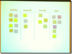
Kanban
another visual tool you can use with agile and perhaps better for elearning projects where you’re often just a one person team.
- provides a visual workflow – use a kanban taskboard
- Limit the # of tasks as in progress to 3
- Manage flow – helps you see where things are and where the bottlenecks are
- Process policies must be explicit
- Improve collaboration
- Kanban is not timeboxed like scrum
-----------------
My editorial: This was a good intro to agile techniques, but I’m still not exactly clear on how to apply this to the many layers of an elearning project. We started talking about elearning projects in specific – for instance each of your tasks in SCRUM could be laid out – storyboard, graphics, etc – and then you break that down into more detailed tasks and assign those to your sprint. So the deliverable for the first sprint might be the storyboard and graphic mocks (for example).
I would like to have heard more about applying this to specific elearning projects. Don (@Dbolen) seems to be a great resource on agile and I will likely explore this more!
Michio Kaku #devlearn opening keynote
These are my live notes from today’s devlearn keynote. Forgive typos and omissions!
Michio Kaku: author of Physics of the Future. http://mkaku.org/ (co-founder of string theory, a physicist)
Today – a guided tour on the future of the elearning process. An authoritative look into the future (he says, while making making jokes about our abilities to predict the future).
Education hasn’t changed much in 2000 years.
Automation has reduced everything in price – except education.
Moore’s Law – computers double in power every 18 months. Your cell phone today has more power than all of NASA in 1969 when they guided Neil Armstrong to the moon!
In 2020, computer chips will cost a penny. The computer will disappear. It will be everywhere and nowhere. (Like electricity – which is everywhere and nowhere). Computer power will be in the ground, the walls. How do we pay for electricity? We meter it? And that’s how we’ll pay for computer – metering through the cloud.
Glasses with facial recognition and can tell you the person’s biography. Glasses will be able to translate languages for you. We’ll be wired to the internet through our glasses. Your home office will be in your glasses! Your glasses ring and it’s your boss.
And if you don’t like glasses – we’ll put the internet in your contact lenses. You will blink and go online.
Tourists walking through Rome – seeing the history of Rome resurrected as you walk through Rome! No need for teleprompters! College students will wear these while studying for and taking their tests!
“In the future…!”
This is augmented reality. Virtual reality is for children. Augmented reality – everything you look at is annotated. Just like in the Terminator. That’s how we will learn in the future.
In the future – information will appear in all shapes and sizes. Your wrist watch to a wall screen. You will choose how you want to ineract.
Cell phones with flexible intelligent screens – even paper will become intelligent (we have plastic transistors)
This is the future of wallpaper! Even the wallpaper will be intelligent.
Our walls will be intelligent -- “mirror mirror on the wall!”
People say the Internet is cold. The Internet was created to fight the cold war. Today the Internet is female. Today it connects us.
Learning will change: learning in the Holodeck (the Matrix) – we will be immersed in 360 degrees by wall screens.
Disposable computers that can be discarded like paper. You scribble on a computer in one room and the scribble will follow you (the cloud) – everywhere you go.
Hardware will become dirt cheap, but software will be valuable.
The future of TV – 3D without glasses using Lenticular Lenses.
In the future, cars will drive by themselves. So, instead of driving, you can sit back and read and learn. The car becomes a classroom.
Doctors will change -- “robo docs” animated TV images that can answer 99% of your questions!
Smart chips in a pill – shrink a tv camera and put it in a pill – no more colonoscopies! In the future, intel will always be inside.
Your toilet will be a computer – it will analyze and discover long before the tumor even grows.
In the future, an MRI will be the size of a cell phone.
In the future, you will have more computer capabilities in your home then a current hospital.
30 years in the future – we will have direct brain interface.
All of us will have a CD with all of our genes on it – an owner’s manual of our body! And only $100.
With this genome we can grow new organs from our own cells…
Today we can grow skin, bladders, blood…
Learning will be everywhere – in your car, in your living room, in your bathroom…
In the year 2020, when computer chips cost a penny – we can grow organs, we can revolutionize learning itself!
New technology like this can cause fear –
- phase 1: “I’m too old for this!”
- phase 2: “wait a minute, I can use this at my work, to socialize…”
- phase 3: “ha! I invented it!”
What was the reaction to electricity or to the telephone? It shocked the world! There were editorials denouncing Edison as a madman.
The Internet, Facebook and Twitter – spread democracy.
But will machines get so intelligent that they won’t need humans anymore?
When Watson beat Jeopardy – people said we wouldn’t need people anymore – but Watson is so stupid, that he didn’t even know that he won. They lack creativity, talent, leadership, the ability to engage people. They are adding machines. They take the drudgery out. It’s not about replacing humans; it’s about expanding the range of our capabilities.
Brent Schlenker kicking off #devlearn
The word of the day is CHANGE.
We hear about HTML5 and Mobile and….and…and…
Brent asks Siri on his new iPhone “Siri, click Next.” Hilarity ensues! (“Brent, I don’t think that’s an appropriate design decision.”)
We should always be asking – are we still relevant?
We need to step up and take a look at what we do – how we use these technologies to have impact in all areas of our orgs.
FIND the information you need to go back to your orgs and start making that change happen.
We’re gonna start the morning looking bigger and broader – where is technology going. This morning’s keynote will open our minds. (So we’re not thinking in the weeds yet about HTML5, etc.)
Morning Buzz with Charles Jennings #DevLearn
Charles Jennings leading a morning buzz session at #devlearn – talking about learning management.
Also in the house: Harold Jarche and Jay Cross.
Don’t start with a training needs analysis (TNA) – start with performance analysis.
Ask:
- what are they doing now?
- what do you expect them to do?
- what’s the impact if they do this?
- what’s the impact if there’s no change?
Training people need to start acting like performance consultants.
Many banks are replacing people with technology.
How do you know what should be spent across an organization for training?
“It’s really a dark art” – says Charles.
A lot of the data out there is meaningless. Because it’s really around the business need.
The org that’s spending less per person is maybe just hiring really smart people…there’s lots of variables.
Most orgs have a budget that they just roll over every year for T&D.
Question about how to deal in orgs where regulatory compliance side has lots of training checkboxes but non-regulated side doesn’t.
Governance boards that are prepared to make senior level decisions help when making L&D transformations
Charles will post some slides up on slideshare about governance…http://www.slideshare.net/charlesjennings