Today I presented a webinar through MyKineo: Power to the SMEs! Empowering subject matter experts to help create better eLearning.
It’s an interesting topic and one I’d like to dive into more with all of you…but what I really wanted to share was my presentation creation process!
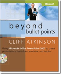
I’ve been reading Cliff Atkinson’s Beyond Bullet Points. Well, I started it but then didn’t get beyond the first few chapters – realized I really needed a project to try it out with as most of the book is the how-to-do-it part.
I pulled my project together yesterday in about four hours – included hammering out content, figuring out the BBP storyboard template, grabbing graphics, and learning how to use PPT beyond the basics that I know. I’m proud to say I mastered Slide Masters last night!
Here are some initial thoughts on the process and the outcome.
The BBP storyboard template
The storyboard template – really an outline tool – helped me sketch out the overall presentation first and organize my thoughts.
Unlike my usual presentation creation style – I actually thought about it first and mapped out my ideas before vomiting them all over PPT! (True confessions of an ID turned presenter…)
 The template is a formatted Word document – if you buy the book you get it on the companion CD. Once you complete the outline, you publish your “headlines” to PPT.
The structure
You start with an overall introduction – five slides that set the scene, identify the audience, introduce the challenge, present the hoped for outcome, and state the call to action (if you look at my deck, the call to action is “Help the SMEs see the forest and the trees with three key strategies”.
Next you create three key points to support the call to action. Each key point gets three explanation slides. An explanation slide then gets three detail slides which get into the nitty gritty details.
Each slide gets a unique headline. Gone are the bullet points. And because you’re writing these at the outline stage – before you even get to your PPT, you can quickly see the structure and see where the gaps are.
Adding a visual theme
On my slide deck, I used slide masters to apply a distinct visual style to each of these three layers – the detail slides have a leaf in the corner, the explanation slides have a light shade of green, the key point slides are dark green with an image of a tree.
The idea of this layer of visual design keeps the audience in tune with where you are, driving home that organizing vision. And as a speaker I found it really helped me know where I was in the presentation.
Here’s a snapshot of part of the deck in slide sorter view – you can quickly see the structure

It’s a start…
OK, it’s not perfect. I pulled this together in about four hours – but nothing like figuring it out as you go along.
I did NOT sketch out the slides in advance when it came to adding visuals, although this is a key part of Atkinson’s process. It was getting late and I needed to get it done.
I also did a half-ass job writing out the detailed content – my “transcript” so to speak. Ideally, you write your script out so it’s all in the PPT Notes field. If you’re look at my deck, you’ll miss all of the stuff I said, but perhaps you’ll get the idea.
In a few sections, I added more detail slides, blowing the whole holy trinity thing out of the water. But it needed to be done…
Because it was an online webinar, I added a few questions here and there to increase audience participation. That’s not part of Atkinson’s model.
I added some initial slides and some slides at the end to provide a final recap and some additional resources. Not sure if that’s allowed in this system!
Check it out and then share your feedback!


