Showing posts with label PowerPoint. Show all posts

Friday, August 27, 2010

Cliff Atkinson’s Beyond Bullet Points

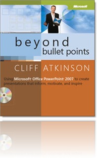
BBP I’ve been slowly making my way through Cliff Atkinson’s Beyond Bullet Points: Using Microsoft Office PowerPoint 2007 to create presentations that inform, motivate, and inspire.

While it’s geared toward the live, stand-up presentation (e.g., the sales presentation, the keynote, a lawyer’s opening arguments at a trial), there’s a lot to apply towards self-paced, asynchronous eLearning programs.

Atkinson draws greatly from Richard Mayer’s research and writings on principles for multimedia design (see Richard E. Mayer, Ed., The Cambridge Handbook of Multimedia Learning (Cambridge University Press, 2005). If you’ve ready any of Ruth Clark’s or Richard Mayer’s books you’ll find yourself in familiar territory:

“…writing out the text of your presentation on your slides and then reading it to your audience contradicts the widely accepted theory of dual channels.  You might assume that presenting the same information in multiple ways will reinforce your point.  But if you present the same information in two channels, you reduce the capacity of working memory and in turn reduce learning by creating what researchers call the redundancy effect.” (p. 46)

(Back to that age old question – should your audio narration read out loud the text on screen? No! No! No!)

In Chapter 2, Atkinson looks at three research realities that should drive your presentation design:

  1. Find the right amount of new information to engage the limited capacity of working memory without going into overload
  2. Engage both the visual and verbal channels
  3. Guide the working memory to integrate new information into long-term memory

These are the guiding principles to his design sensibility:  PPT slides with a strong headline, a strong visual and no text bullets (leave that to the live presenter to elaborate!)  Ultimately, the goal is to communicate and transfer knowledge – not to create a presentation.

The book provides a balance of theory and practical how-to advice, answering the question “why do I need to do this?” and then “how do I do this.”  He provides storyboard templates to help you create your initial structure, tips for writing and weaving a compelling story throughout.

For those of you who have been storyboarding your eLearning for years, his storyboard will be familiar – although it’s simplicity will astound!  He bases the template on three acts, creating a compelling arc to your presentation that will hook the learner in and keep ‘em engaged.

Whether you’re designing eLearning to be created in a PPT conversion tool like Articulate or Adobe Presenter – or working with a more custom, bespoke solution like Flash, I think you’ll find design principles that you can relate back to your own work.

Have you read this book?  Did you put any of this into practice?

Wednesday, August 12, 2009

Jane Bozarth Follow Up

For those of you who missed Jane Bozarth's session yesterday: Better Than Bullet Points: Creating Engaging e-learning with PowerPoint -- a recording of the session and handouts are now available (you'll have to register):

http://www.trainingmagnetwork.com/discussions/show/769


Jane has posted some links following the webinar which you can find here (you'll also have to register):

http://www.trainingmagnetwork.com/groups/show/394


My notes on Jane's session can be found here.

Tuesday, August 11, 2009

Jane Bozarth: Better than Bullet Points

Jane Bozarth: Better than Bullet Points: Creating Engaging eLearning with PowerPoint.

Session hosted by Training Magazine.

Effective design using PPT as a tool.

Not PPT 101. But will talk about how to make instruction more engaging, interactive and interesting.

Why PowerPoint?

We have it. It’s cheap. It’s idiot proof. Pretty universal. Easy to deal with.

Many tools out there that still have to start with ppt

Use it as a storyboarding tool, prototyping.

Can do an awful lot with PPT.

Most of Jane’s examples – from people with lower budgets – not the glitzy example (we need to make learning engaging, not pretty).

Creating asynchronous instruction.

Frustration with eLearning:

Becomes dumping ground for slides, text, content

All the fun stuff kept for the classroom.

Info dumps are not instruction!

How BAD can e-learning be?

73 slides of text. Inexplicable clip art. Not elearning, but ereading.

“etorture” (said by someone in the chatroom!)

Pages and pages of scrolling text. Pretty much just a policy manual.

Even when you make programs like that mandatory, still only have a 5% completion rate.

Better than Bullet Points

  • Develop a treatment
  • Apply Richard Mayer’s SOI model
  • Choose graphics with soul, interactions with meaning, and animations that teach

Taking an existing classroom course – think about TRANSFORMING it, not converting it.

1. Select a Treatment

Don’t just present lots of data.

put it into context (create a story around it – example: A. Platura Art Detective to each about perspective).

Use hyperlinks to answer questions.

It’s very easy to load content on slides – but it takes more creativity to move learner to actual understanding!

Use scenarios – apply what you know to make a decision..Ask the learner to take info that’s not clearcut and apply it using a question (in PPT – picture of a farmer and 3 images of “experts” to ask for advice. Whose advice do you follow?)

SMES get married to the content and often lose sight of the bigger picture.

Present the info – not as a text dump – but rather “what happens in the real world?”

Example:

You decide:

  • Read the complaint
  • Review the evidence (this links off to different slides – email evidence, etc.)
  • Decide who wins the case

When you see something you like, try to do it in PowerPoint.

Idea Kickstarters

Talk to others outside of your area of expertise

Use the Goofus and Galant approach – compare and contrast the good example vs. the bad example

2. Apply Mayer’s SOI Model

Where projects derail. Have a good idea, but want to put too much stuff into it.

Richard Mayer – research on multimedia learning.

“Select, organize and integrate”

  • Select important information
  • Organize it into meaningul wholes
  • Integrate it with real world problems

Select:

Help the learner understand what they’re going to do. Filter info for them.

Use good headings.

Organize:

  • outlines
  • headings
  • graphics
  • structure text (compare/contrast, cause/effect, classification order/sequence)

Integrate:

  • illustrations with captions
  • animation with narration
  • worked-out examples
  • elaborative questions

Take all of the info and make better sense of it for the learner.

“Effective design is done when there’s nothing left to take out.” [not that you’ve found a way to put more stuff in.]

Intregrate text with graphics – don’t have a picture on one side and the list of items to look at on another side of page. Might look neater, but too much cognitive load. Put the labels right on the picture.

Taking information and applying it to a real problem

How do we keep from overloading learners?

  • chunks
  • keep it short
  • get rid of extraneous information
  • don’t assume learners are idiots – they don’t need everything spelled out to them.
  • make it relevant to the job and not just information

3. Choose Graphics with Soul, animations that teach, interactions with meaning.

Finding graphics: flickr, istockphoto, etc.

Useful feedback in an online quiz

Use feedback to help the learner learn.

Other tips:

Insert photos instead of cutting and pasting them – smaller file sizes!

Bad elearning can be horrible no matter what tool you use. It’s about design, not software!

Less is more.

PPT Blunders when designing eLearning:

  • too much text
  • bad graphics
  • flying text

My review: Jane is a fabulous presenter. Very fluid delivery. Lots of great examples. Time well spent.

Update:

For those of you who missed the session, a recording and handouts are available (you'll have to register):

http://www.trainingmagnetwork.com/discussions/show/769

Jane has posted some links following the webinar which you can find here (you'll have to register):

http://www.trainingmagnetwork.com/groups/show/394


Friday, April 06, 2007

David Byrne and PowerPoint

Remember back in 2003, when David Byrne published a book (described by AP Technology Writer Rachel Konrad as a "coffee table book for nerds") called E.E.E.I. Envisioning Emotional Epistemological Information?

Oh that David Byrne, he's so creative and alternative co-opting PowerPoint like that. Check out some of the still slides from his work (I wish he would post the actual presentations...but I suppose even David Byrne wants us to buy his book).

In a March 13, 2005 article in The Toronto Star The Art of PowerPoint: David Byrne (Yes, that David Byrne) Defends a Reviled Software, "Byrne suggests that the medium itself is not the sole factor behind ill-fated attempts at over-simplifying complex information." The noted Edward Tufte blames PowerPoint. In contrast, "Byrne maintains that the proper use, or misuse, of PowerPoint lies in the hands of the user."

Here, here.

And the same holds true of rapid e-Learning tools and any in-house training effort. Of ANY e-Learning effort...This is why this training industry is not dead yet.

Thursday, April 05, 2007

More on PowerPoint and Instructional Design

Continuing the PowerPoint conversation begun yesterday here and picked up by Clive on Learning: Don't blame PowerPoint...and Quintus Joubert PowerPoint vs. Interactive Learning...
-------------

Here's another article on PowerPoint, found via Donald Clark at Big Dog, Little Dog: Bite the Bullet: Improving Your Presentation Strategies.

Some design tidbits:

Another colleague, Cliff Atkinson, who wrote Beyond Bullet Points, suggests taking most of your bullets off the slides entirely. Instead, put them into your Notes. You can use the notes for your own preparation, but by leaving just images on the slides you can deliver a polished talk that has a lot more impact; you won't be reading the
bullets (guaranteed Death by PowerPoint) and neither will the audience (who can
become distracted).

And this:

Few stage plays begin with all the actors on stage. For the same reason, you shouldn't project a complicated slide or diagram as one complete unit. Besides
the actors' egos and their need for an entrance, the fact is that no one can absorb a complex idea all at once. Introducing your important ideas sequentially lets them be absorbed more naturally. You can use the animation features of your presentation program to build your ideas a step at a time. Also, when you show a complex slide, the audience is distracted by trying to figure it out as you discuss it, so give it to them in stages as you talk about each concept.
Ho hum. This is all basic ID stuff, I suppose.

I also stumbled on this interview by Karl Kapp with Jane Bozarth over at e-Learning guru.com that had some good nuggets on basic instructional design and using low cost tools (like PowerPoint) to build effective e-Learning.

I've always pooh-poohed PowerPoint as an e-Learning tool...but it's all in how you look at, I suppose. And the truth is that so many of these so-called great e-Learning authoring tools out there these days just provide a developer with basic PowerPoint functionality plus a SCORM wrapper. Whoopeee.

But, as Clive says, we shouldn't blame PowerPoint -- nor should we blame all the authoring tools. It's the instructional design you lay on top of these tools that matters...

BTW -- If you haven't already, be sure to check out the demo lite version that's available for Clive Shepherd's course "Ten Ways to Avoid Death by PowerPoint". Excellent use of storytelling to make a point!