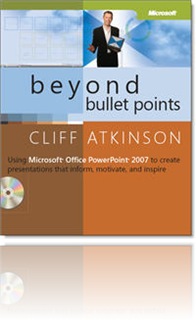
While it’s geared toward the live, stand-up presentation (e.g., the sales presentation, the keynote, a lawyer’s opening arguments at a trial), there’s a lot to apply towards self-paced, asynchronous eLearning programs.
Atkinson draws greatly from Richard Mayer’s research and writings on principles for multimedia design (see Richard E. Mayer, Ed., The Cambridge Handbook of Multimedia Learning (Cambridge University Press, 2005). If you’ve ready any of Ruth Clark’s or Richard Mayer’s books you’ll find yourself in familiar territory:
“…writing out the text of your presentation on your slides and then reading it to your audience contradicts the widely accepted theory of dual channels. You might assume that presenting the same information in multiple ways will reinforce your point. But if you present the same information in two channels, you reduce the capacity of working memory and in turn reduce learning by creating what researchers call the redundancy effect.” (p. 46)
(Back to that age old question – should your audio narration read out loud the text on screen? No! No! No!)
In Chapter 2, Atkinson looks at three research realities that should drive your presentation design:
- Find the right amount of new information to engage the limited capacity of working memory without going into overload
- Engage both the visual and verbal channels
- Guide the working memory to integrate new information into long-term memory
These are the guiding principles to his design sensibility: PPT slides with a strong headline, a strong visual and no text bullets (leave that to the live presenter to elaborate!) Ultimately, the goal is to communicate and transfer knowledge – not to create a presentation.
The book provides a balance of theory and practical how-to advice, answering the question “why do I need to do this?” and then “how do I do this.” He provides storyboard templates to help you create your initial structure, tips for writing and weaving a compelling story throughout.
For those of you who have been storyboarding your eLearning for years, his storyboard will be familiar – although it’s simplicity will astound! He bases the template on three acts, creating a compelling arc to your presentation that will hook the learner in and keep ‘em engaged.
Whether you’re designing eLearning to be created in a PPT conversion tool like Articulate or Adobe Presenter – or working with a more custom, bespoke solution like Flash, I think you’ll find design principles that you can relate back to your own work.
Have you read this book? Did you put any of this into practice?
6 comments:
Very timely for our group, which is settling into the the conclusion that elearning here will use ppt as our palette, with all it's strengths and weaknesses. And anyone who's every tried to write a screenplay will be well equipped to grok the three-act structure and capitalize on it.
Funny how we knew as trainers and presenters not to read our slides verbatim because it was boring. Now research tells us it's not only boring but hinders learning. What do you know!
As somebody who is blessed with good hearing and vision I agree that reading text in any format can be redundant and irritating. However, what about the ADA and sensitivity to the deaf and visually impaired?
This is a little learning module I designed for a class:
http://nerdsmakemedia.com/isd.html
I had to do an audio component anyway, so I just figured that I'd narrate the whole thing. It's easy enough for somebody who doesn't want the audio to turn down or mute the volume. It also seemed possible to me that somebody who had already interacted with the module and learned what they could from the visual component might want to listen to just the audio component while doing something else as a review.
I'm learning alot from this blog, love the idea of a self taught master's degree (I'm in a Certificate program now).
I did get a chance to have a glance at this book in my library's reference section. Looks like great stuff. I've ordered my copy and should reach me in a couple of days!
The book makes sense. When I've used the techniques people comment that the work is some of my best. Using consistent themes ties things together.
- a circus theme for a Sarbanes-Oxley audit
(which is a circus at times).
- a weather theme for web site design.
The author shows other examples. Design your own 3 Act Play and see for yourself.
I haven't read this book, but now that I've read your review I will. While my company currently doesn't use PPT to create elearning, I think the design principles could apply to elearning in general. (screens are screens, no?)
Thanks for sharing good works.
Post a Comment