Wednesday, December 30, 2009

Top Nine Posts of 2009

Why not ten? I don’t know.

1. Essential Reading for Instructional Design?

This post from February 2008 is still at the top, lists and links to books and articles, including Dr. John Curry’s post How to Get an Instructional Design Education Without Paying Tuition.

2. Getting Started in Instructional Design

Another oldie, from 2007. Probably simply popular because it’s on the sidebar list in my blog. Tells you something about placement.

3. Building Better Learning Games

My live blogged notes from an April 2009 webinar with Enspire learning.

4. Instructional Design – What’s in a name?

From January 2009, in which I get Karl Kapp’s goat ;)

5. The Corporate Moodle – A Tipping Point?

I wrote this one back in June 2009 and it does seem to be the year of Moodle. The eLearning Guild’s 2009 LMS report certainly agrees, and by evidence of the number of corporate Moodle projects we’ve worked on this year at Kineo the tipping point seems to have arrived.

6. elearning Authoring Tools Review – Help!

I asked for readers’ input to create a mindmap of eLearning authoring tools. Lots of great information here!

7. The Value of Instructional Designers

This two year old post from January 2008 apparently still has some traction (again, might be its placement in my blog sidebar). Do IDs need to know how to use the tools? Cammy stirring up the ID pot again.

8. Making Six Sigma Training Fun

A post from May 2008, in which I discuss the use of rubber ducks. Apparently, trying to make six sigma training interesting is a challenge many of us face.

9. My Objection to Learning Objectives

I don’t object to learning objectives, but rather the dry manner in which they’re presented. Isn’t there a better way? From December 2007.

****************

Looking through this list, most of these posts weren’t even written in 2009! So I guess I just already said all that i have to say that’s remotely interesting…

Here’s to finding more to talk about in 2010! Happy New Year everyone!

Monday, December 28, 2009

A Year in Books (2009)

2009 was a big year for me.  New job.  New company.  Working full time from a home office.  Oldest child in kindergarten.  New challenges – and some old ones too.  

A great year, really.  Thanks for joining me in this journey and for all you’ve contributed to my learning over the past 12 months.

To try and hold on to – if 2009 booksjust for a brief moment – some of what’s been going on in my brain this year, I thought I’d take a moment to catalogue the pile of  topical books I’ve read.  Hopefully I learned something from all that book reading.


In no particular order:

Instructional Design and eLearning

Because this is what I do.

Multimedia Learning, Richard Mayer.  The classic, in which Mayer looks at research and provides conclusions on effective use of multimedia in eLearning.  Ruth Clark works with Mayer’s research results (in fact, much of Ruth Clark’s presentation at DevLearn this year was a summary of Mayer’s Multimedia Principals).

Designing World Class e-Learning:  How IBM, GE, Harvard Business School, And Columbia University Are Succeeding At E-Learning, Roger Schank.  I hadn’t read any Schank before this one.  In depth case studies, looking at goal-based scenarios.  Great e-Learning on a huge budget, no doubt!

Michael Allen’s E-Learning Library Creating Successful E-Learning: A Rapid System for Getting It Right First Time, Every Time, Michael Allen.  Another Michael Allen classic.

Moodle 1.9 Multimedia, Joao Pedro Soares Fernades.  Ideas and best practices on using multimedia effectively in Moodle.  Working with and designing for Moodle was new for me in 2009.  I have much to learn.

Visual Design & Presentations

In 2009, I co-presented two sessions at DevLearn, gave a talk at the Massachusetts chapter of ISPI and presented a few online webinars.  2010  looks to be more opportunity – I’ll be co-presenting three sessions at the eLearning Guild’s Learning Solutions conference in Orlando in March, running an eLearning Guild Online Forum in January.  And who knows what else.   That said, I don’t want to be one of those boring presenters who gets tomatoes thrown at me for putting up horrible text slides.  Oh yeah – good stuff for e-Learning too!

slide:ology: The Art and Science of Creating Great Presentations, Nancy Duarte

Back of the Napkin: Solving Problems and Selling Ideas with Pictures, Dan Roam

Other

Catching up on the pop business books from the last few years, these books gave me a little insight into current thinking.

Free: The Future of Radical Price, Chris Anderson.  Ironically, I paid more for this book than any other book this year.  $28 impulse buy at an airport. 

Tribes: We Need You to Lead Us, Seth Godin. 

And also, The Zombie Survival Guide: Complete Protection from the Living Dead, Max Brooks.  Critical for getting through DevLearn!

************

I’m sure I’ve missed a few. 

Long live books!

(So what should I be reading in 2010?)

e-Learning Templates

If you’re developing eLearning on your own with minimal help from a graphics team, you might want to check out e-Learning Templates.com.

image

Put together by two guys who call themselves “The eLearning Brothers”, the site offers PPT templates you can use in your Articulate courses, along with complete course style kits to Flash based eLearning games and quizzes.

“Each template is fully customizable in Flash (we give you the .fla Flash source file). Made to work within most rapid elearning software (Articulate Presenter, Adobe Captivate, Rapid Intake, Adobe Presenter, PowerPoint and more).”

Sounds like a good resource for freelancers and eLearning designers working in small departments or as a one-person show.

If you try it out, leave a comment here and let us know what you think.

Sunday, December 20, 2009

"Proven Instructional Design": Bingo!

Have you ever seen the claim: "built using proven Instructional Design."

(I just saw it. Some website. Ain't saying where. But I could equally have found it on the back of a cereal box.)

Do you ever wonder how they proved it? Did they prove it?

What are they actually talking about? It's one of those buzzword bingo terms people use.


Photo credit: Bingo Sign by CarbonNYC

Wednesday, December 16, 2009

eLearning Guild DemoFest Highlights #dl09

Follow up to the eLearning Guild’s DemoFest held at DevLrn in San Jose this November.  These are favorites of that event.

(These are my live blogged notes from the presentation.  eLearning Guild will make recorded presentation available on their website. http://wwww.devlearn2009.com/demofest)

Brent Schlenker:  This year a lot of great entries.  This year didn’t do awards format – wanted it to be a sharing format for attendees to show what they do.

iPhone App: Helping Parents Grades K-5 (Terri Gutierrez)

Oregon Center for Applied Science

http://www.orcasinc.com

Took parenting website and converted to iPhone.

Innovative use of mobile technology.  There was a lot of buzz around this app at demo fest.

Had created 4 parenting programs on website.  Organized by Family Challenges – branching exercises.  - “Unfinished Chores” – included situations in families via videos – then you pick one of three responses after seeing video.  After viewed each choice, got a testimonial from each family member.

Then went to a Q&A – open text response and you compare your response to the suggested response.

The iPhone App – 5 folks working on this program.  Took a week to go through iPhone App training.  Took content and pared it down to work on iphone.

“Your kids won’t do their chores.  There’s an app for that.”

Had to edit video content from website – rechunking scenarios, etc.

Maintained branching scenarios.

Text pages with responses and key concepts.

Spent a lot of time figuring out the flow of the application.  On the iPhone more restricted in navigation – needed to make sure people weren’t stuck in an endless loop.

5 weeks of development time, 1 week of training time.  Design of application was only about 4 days.

http://iphone.orcasinc.com/

Stanford University iPhone Programming class: http://www.mobileorchard.com/take-stanfords-iphone-programming-class-for-free/

Advancing the Common Good and LIVE United: An Overview (Patrick Gallen)

United Way – largest non-profit in the world.  2.5 million volunteers!

Course was to provide staff with basic information about work.  Source materials were PPTs. Created an Adobe Connect Meeting Room – Chapters – added chat pod.   Could go into meeting room while learners were in there to interact with them. 

Asynchronous courses were offered in a room – so you could interact with other learners who were in there, instructors, etc.

Content generated in PPT, used Presenter plugin to upload to Connect.  Used some Captivate for interactivity.

4 month project, 2 people working 1/4 of time.

Tools:  PPT, Presenter, Captivate, Photoshop, Adobe Connect

Lessons learned:  maximize simple tools, partner with SMEs to make content more accessible, trimming fat, being creative/outside box, put self in the learner’s shoes, get something out there.

United Way had never developed an online course before.

Journey’s New Hire Training Allen Interactions (Scott Colehour)

New hire training dilemma for a younger generation -- (Journeys is a pre-teen/teen focused shoe store) . Retail store employees selling shoes and working stockroom/backroom.  If can’t find the shoes, can’t sell them.

Introduced general concepts of stockroom.  intro screens with diagrams and text.  Then took them right into an activity.  Look at a stockrrom and organize it – a few boxes are out of place. 

image

Once they got the basics, took them into more of a game with timed interactivity (boxes rolling in on conveyor belt).

Selling Activity:

Sales Scenario is the culmination. 

Customer comes in and you need to make observations and greet customers. 

“Sellometer” -- shows how well they are doing and get some coaching as they go along.

image

University of Central Oklahoma: Creative use of green screen to add personality to online courses (Andrea Stone, Bucky Dodd, John Gillmore)

Support faculty and staff. 

Problem: online instructors are anonymous.  Want to help people recognize their instructors when see them at the grocery store!

Add personality to the online course with video that allows them to walk across the page.

image

Online host/video instructor guides through this module.

Faculty/online instructors using this to introduce their courses “Hi, I’m Professor X and we’re going to do…” 

image

Get a sense of who the instructor is vs. just reading onscreen text.

Process for creating green screen:

image

Equipment:

  • Botera/Chroma Key Collapsible Background $130
  • Need good lighting for even background to help with chroma – light kit was about $460.
  • Laptop computer *800
  • Use PPT in place of a teleprompter for the instructor.
  • Use Premiere Pro (because they already had it).
  • Borix FX Chroma Key software $300
  • Sanyo High Def Camcorder $350
  • Do at 720p resolution so get higher quality green screen filter and then reduce it.
  • Shure Lavalier wireless microphone System $299.
  • Their total kit without laptop and Cs4 was under $2000

See slides of this info here:

www.uco.edu/cpde/presentations/greenscreen/UCOGreenScreen.pdf

Connect Writing (Nick Floro)

Product helped developed for McGraw Hill Education.

  • Help high school students improve writing
  • Diagnostic Test triggers learning plan
  • over 60 characters in stories

Diagnostic exercises for writing scenarios, correcting errors in a writing exercise.

image

Creative uses of tools all around!

Recording will be posted here:  http://wwww.devlearn2009.com/demofest

Wednesday, December 02, 2009

When Accidental Instructional Designers Become Intentional

There's been a great conversation going on around my last post "Accidental Instructional Designers". Check out the comments, and also be sure to look at Sahana's response on her blog.

Sahana is a practicing ID in India, where ID programs don't really exist yet. Instead people turn to 8 week ID certification programs to get started.

Karl Kapp feels like I'm chewing his chaw a bit and was reminded of his own post from last year: We Need a Degree in Instructional Design (yes, the conversation has been going on for ages -- and I sometimes am always in the middle of it!)

I don't mean it to devolve into the "do you need an ID degree or not?" conversation. I'm ready to move past that. I've made up my mind :) *

But it seems like it's a bit of the ID lifecycle and IDs love to banter this one about. Perhaps it's just that people get entrenched and defensive of their own paths. But I think we can also say that the landscape today has greatly changed, and a formal ID degree may not be necessary...

Questions I have:

At what point does an "accidental instructional designer" become intentional?

What does the typical ID grad student look like? Are they mid-career, having worked in the ID field for x number of years and now looking for that foundation?

As Brent Schlenker said in the comments on Sahana's post -- the web 2.0 world has completely changed how we access expertise and information in this field. It's a different time and place today than it was 10 years ago.

I do agree we're all ready to start talking about what the critical ID competencies are for today's corporate instructional designers.

Connie Malamed (The eLearning Coach) has made a nice start with 10 Qualities of the Ideal Instructional Designer.

So what do you think are the key competencies for an ID practicing today? Hmmm...


* For the record, I don't think I will get a graduate degree in ID. At least not this year. I've written about this before -- I'm getting it informally. Here. With all of you. And it's customized precisely for me. And it's free. I like free. Plus, I don't have time to go to real school! I've got too many other things to do.


Tuesday, November 24, 2009

Accidental Instructional Designers #dl09

coffee At DevLearn ‘09, I had the pleasure of hosting a Thursday morning Breakfast Byte. 

Conference participants gather around a topic of interest at an ungodly early hour, while sipping coffee and eating croissants.  A bleary-eyed, loosely organized conversation.

If you know me, you’ll know my topic was right up my alley:

 “Instructional Design:  You Do What for a Living?”

Over 25 IDs gathered to talk about how they got here and where they're going.

I asked people to introduce themselves and tell their stories – how they each got into instructional design.

Some points of notes:

  • Of the 25 plus IDs in the room, only two had advanced degrees in ID.
  • Most people found themselves in the role of ID somewhat by accident – by “discovering that I had a knack”, demonstrating an affinity for ID, by being a good teacher, etc.
  • We all agreed that no one set out in their early days with the grand vision of becoming an instructional designer.  Many of us thought that we would be teachers.
  • A senior ID at a well-known high tech firm in Silicon Valley told us they had hired a number of well-degreed IDs.  None of these IDs made it longer than 6 months as they were too rigid in their approaches and not able to work in the open-minded, flexible way that the business required.
  • Steve Nguyen said “Why can’t we just be seen as people who create great content?”  He mentioned the LeFevers at CommonCraft who create amazing instructional videos without an ID degree!  Ah – the heresy…
  • The perception was that ID degrees teach people the technology and the means, but not how to focus on the content.  Instead it’s about the bells and whistles and flash.
  • One participant revealed himself as a non-practitioner – a manager spying on us IDs.  He thought the phrase “we create content” an interesting one.  “Do you really create content?  Isn’t it out there already?”  We talked about packaging content.  But some said, “well, I create new graphics, new ways of seeing things so that’s creating content.”

I then asked the group to think about essential ID competencies: 

  • Creativity
  • Know the science behind learning – know what works.
  • Keep up with things
  • Know when to stay quiet, when to speak.  Make it relevant.
  • Help teach people how to learn in new ways.
  • Journalism skills – how to interveiw a SME, how to look at aggregate content and sitill it to the essentials.  The journalistic pyramid.
  • Consulting skills rather than order taking.  Help the business by identifying what problem you’re trying to solve.
  • Challenge the status quo – what if we do it differently?
  • Create learning experiences – what is fun?  what turns people on?
  • Know how brains tick.
  • Know how to facilitate.
  • Build in motivation.
  • Know story and design and how it translates to people.

What about you?  What was your road to ID?  What do you see as key ID competencies in the 21st century?

Photo credit:  Free Cup of Coffee and Flowers at Daybreak Creative Commons by D Sharon Pruitt

Thursday, November 19, 2009

Yawn-proof Your e-Learning without Busting the Bank #dl09

Last week at DevLearn in San Jose, Stephen Walsh and I presented to a packed room: "Yawn-proof Your e-Learning without Busting the Bank"

It was Friday morning and everyone was quite exhausted. Before we got started, I joked that we'd know we'd been successful if no one yawned.

I think people were quite engaged and I didn't catch any yawns, so I'd say we hit the mark. 

Here are slides from our presentation. I'm sorry I can't share links to all of the demos we showed, but you can find some live examples on the case studies section of the Kineo website.  Enjoy!

Yawn Proof Your e-Learning without Busting the Bank

View more presentations from cammybean.

Cammy and Kineo in New York

I'm hanging out in Times Square right now, looking forward to our seminar here tomorrow morning. New York is so exhilarating. The lights! The tall buildings! I feel like such an awestruck country bumpkin.

Here's where I'll be:

Kineo hosts e-learning conference in New York on Nov 20th


New York Workshop: Strategies for Delivering Effective eLearning in Trying Times

Join us in New York on Nov 20th for a breakfast session, kindly hosted by Barclays, one of Kineo's key US and UK clients.

We’ll discuss how creative strategies can overcome tight budgets and limited resources to create great eLearning. We’ll explore case studies from leading organizations such as Barclays, Deloitte, and McDonald’s and look at innovative uses of commercial and open source tools like Articulate, Flash and Moodle.

The workshop will be held at 745 7th Avenue 4th Floor, New York, NY. Continental Breakfast and Networking from 8:00 – 8:30 and Workshop from 8:30-10:30.

The event is free, but spaces are limited. Contact info@kineo.com to reserve your space.

Friday, November 13, 2009

DevLearn ‘09 Friday Keynote: Leo Laporte #dl09

Live blogged notes from the Friday morning keynote at DevLearn in San Jose.

Leo Laporte: www.Leoville.com “The Tech Guy!” a US-based journalist specializing in technology coverage on radio, TV, and the Internet.

What I have learned in mass media – where it’s failed us and why we’ve reinvented it (new media).

His story.  But first, this one…

Mass media: a 2oth century invention that is starting to fall apart.

Started early 1900s with radio.  Before that, media was local (cave paintings). Radio changed everything. Initially radio was a one-to-one tool (ship to shore radio). Then decided to broadcast radio – one to many.  RCA made music boxes for the living room.

We’re now in a similar mode. Starting to realize how can use computers and internet in different way.

Mass media was fostered by advertisers – a new way to reach customers!  An unholy alliance. Made a lot of people rich, which was good because media required a lot of money (radio towers, newspapers).

It was a monopoly and fundamentally undemocratic.

Leo Laporte: started in radio in the 70s.  You had to pay your dues.

Mass media didn’t really serve us all that well.

Do you even know who anchors the CBS news anymore?  It doesn’t have the power it used to. 

Two things that have changed everything:

  1. The microprocessor (Moore’s law = chips get twice as powerful every year and a half.  A geometric progression.)  This has powered an amazing revolution which changed both the media and the eLearning business. We can now turn analog content (audio, video) into bits.  Perfect copies that can be moved at the speed of light.

TV was going to change education. 

In some part of the world, people don’t have electricity – don’t have tvs – but they do have cell phones.  Community charging stations.  This is the digital transformation – puts us in touch with each other.  Gives us the power to become media moguls on our own.

TV as a powerful medium to educate and transform the world.  But we were mired in the mass media mindset.  Cable channels cost a LOT of money to run.  $100 million a year (and that’s not spent on the programming).

Leo Laporte Tech TV in the 90s.  Got into 41 million homes.  The 200,000 people who really watched were really interested in this.  But it was SO expensive to do a cable channel that this wasn’t sustainable.

This is what the cable guy said about why TechTV wasn’t going to make it:  “Brand is the refuge of the ignorant.” – smart people don’t care about brand and aren’t swayed by advertising.  So the TechTV guys couldn’t make it, because they’d have to dumb it down so that the advertisers would be interested.   (Laporte is not saying he agrees with this notion….)

Laporte thought he’d be fine with those 200,000 people watching his stuff. 

Now the media monopoly is crumbling because we CAN create our own content.  Free, local distribution (the internet). Newspapers are struggling. TV channels – no one’s watching them.  (And yet people are watching more tv?  6+ hours?) – People are going to the internet now for  their content. 

Every minute on YouTube – 20 hours of video are uploaded.  (mostly by young people!)

Undemocratic media is being replaced by personal, public video.

“But there’s too much stuff and most of it is crap.”  But maybe 1% is not crap!  That’s still a lot of great video being uploaded all the time.

Anyone can now create a podcast.  Using your iPhone.  No fancier tools than that (there’s an app for that).

April 2005 starting doing weekly podcast “This week in Tech”.  Got to the point he was doing 12 podcasts.  LOTS of people were downloading.

But it was still limited…not a mass media tool (too many steps to get to your podcasts).  He still wanted to reach more people. 

Started doing livestream video and thousands started watching that.  Now it’s grown hugely – he’s basically built a tv studio now at a fraction of the cost.  (used to take 22 people and a million dollars of equipment to do a tv show).  Now he’s working with a $50,000 studio.  Doesn’t have any camera operators – he does the whole thing himself.  Broadcasts it on internet for free. 

15 computers around him – some of these are just little cheapies ($400).

Laporte lives in Petaluma.  With Skype he can talk to people are around the world.  Over 1000 people in the chat rooms.

How much of a conversation is going on with you and your community?

Traditional mass media gets worked up – “these people are radicals”.  The monopolies are not giving up easily.

The more voices we hear – for good or for bad – the more likely that we’ll do the right thing.

The big businesses are trying to change the internet to reflect their interests and not ours. 

We need to be aware of what the big companies are trying to do…they want to shut down the free internet.

www.Savetheinternet.com

an open free internet transforms our lives.  We need to pay attention.  We are the ones who need to do that.  Geeks need to be the ones to stand up and be counted.

The Call to Action:  save the internet and get out there and tell your stories!

It’s not just a new media, it’s a new paradigm.

Thursday, November 12, 2009

DevLearn ‘09 Keynote: Eric Zimmerman #dl09

These are my live blogged notes from Thursday’s keynote at DevLearn.

Eric Zimmerman – started career as an artist. 15 years in game industry. Gamelab CEO.

Book:   Rules of Play – Game Design Fundamentals (Eric wrote the textbook on that!)

Meaningful Play

Opening with the a rousing game of rock, paper, scissors…

Meaning

A closed fist: in rock, paper scissors it means a certain thing.  The game gives the gesture meaning.

MMRPS - massively multiplayer rock-paper scissors. Round robin style – everyone is now playing the game!  And we’re down to the final two: Josh and Alex

Who am I?

Game designer.  Written a few books (The game design reader), ran a game company for 9 years – including diner dash.  Started Institute of Play (a non-profit).

Today:

  • Nuts and bolts of game design
  • Teaching, learning and literacy
  • the big picture

Shows a quick video of game evolution – checkers < pong < space invaders < clone wars…(David Perry at TED)

But games are NOT graphics.  Rock, paper, scissors has nothing to do with putting pixels up on a screen.

World of Warcraft (WOW) – using ebay like trading system within WOW is not really about the 3D space.

Chess/Boxing championship – players alternate rounds of boxing with chess. Really.

Games one of our most ancient forms of interaction.

What is so new today?

Games do have a special relevance to us today in terms of learning and literacy. The way we work and learn and connect…all of these aspects of our lives are mediated by digital (mobile tech, internet, etc.) – which is changing what it means to be literate.

Now entering a Ludic Age (an age of play).

The Information Age

  • factory processing
  • paper bureaucracy
  • telephone switchboards
  • pneumatic tube networks
  • abstraction of information
  • ones and zeroes
  • a century of an image

The Ludic Age

New kinds of literacies.

Literacy – ability to create meaning and understand meaning. Literacy is the idea of creating and understanding meaning.

James Paul Gee:  What Video Games have to teach us about Learning and Literacy (book)

Today – to be literate is something new.  As information is put at play, game design becomes a model for literacy.

3 concepts today: Systems, Play, Design (linked to literacy and thus linked to learning)

SYSTEMS

a set of parts that interrelates to form a whole (think of our MMRPS – as the room played, dynamics changed. )

No matter what kind of training you’re creating, don’t you want to create that kind of excitement?  When there’s an emotional component to learning, people retain more.

Scrabble – a set of parts interrelating to form a whole.

Systems Thinking:

How do systems relate?

The key skill for the coming century is not to memorize facts, but to do the research – to solve the problems. 

  • Teach people how to get information and critically filter that information.
  • How to use and deploy that information.

Electro City – wonderful example of integration of games and learning.

Pandemic – board game – collaborative play to stop outbreak of a global pandemic.  Applying systems thinking (how parts interrelate).

Designing System Thinking: chose systemic subject matter NOT content: instead, systems of interaction, parts and wholes

If creating a game on history – not focus on facts and history, instead focus on process.  Maybe it’s not about actual history, but possible things. Or take history as it happened and trace relationships…

If using games in an instructional context, use them for what they do well.  Systems. – collection of parts that work together to form a whole.

PLAY

Play a game. 

Colors.  A massively multiplayer color-matching game.  Trading cards…(I don’t think I can explain what just happened.  We all had colored index cards.  You can trade your card with adjacent people.  The goal to get the largest group of adjacent people with the same color cards.  Yellow won.)  [Was there a rule that you couldn’t move?] 

Rules & Play – game designers create rules of play.  Game designers create an experience by creating rules.

What are rules?  Dry, rigid, scientific guidelines. Rules are fixed, rigid, locked but play is spontaneous.  The paradox.  Play happens because of rules of game or in spite of the rules of the game?

Forms of play: competitive, narrative, etc.

Colors the game was a set of rules that became an experience of play and created new meanings. (We all had cards of different colors.  Index cards.  And suddenly these cards had meaning.  Within the context of the game, this card has meaning.  People were waving and yelling and brokering their cards.)

Play – “free movement within a rigid structure.”  Something has “play” when it’s a little lose – the “play” of the steering wheel.  The play is only there because of the other structures (the tires, the axels, etc.)  The play is the interstitial space. That little wiggle room when the system is not functioning in a purely logical manner.

Play gives us the unexpected.

Different from traditional ID – this is what we want you to get out of it….

Sissy Fight (game Eric created 10 years ago) – social community around sissy fight came up.  Fan art examples.  None of the fan art was expected. The system generated unexpected forms of play.

[How can you create an experience – a space – where the unexpected can happen in your learning design?]

How is play relevant to learning and literacy?

  • Systems are necessary but not sufficient.
  • information put at play
  • Play is innovation
  • play transforms thinking

Our education is going back to the 19th century with heavy emphasis on standardized testing.

Examples:

  • space invaders projected on a wall of a building.
  • Race of huge game pieces through a city
  • Come out and play festival of street festivals – mini golf in urban environment using physical objects as part of game (sewer hole lid as the ball cup).

Being playful – not taking structures for granted. be a bit subversive (being playful subverts the completely utilitarian function of something)

Making play happen:

  • Is there room for play in your system? 
  • Are you creating spaces where unexpected things can happen?
  • Can your players/your learners be creative and flexible

DESIGN

Designing meaning.  Games are activities – what is the player actually doing?  Your design gives meaning to the player’s action.  

A game is a context designed to support meaning to action.

Many levels of play in a game – social play, strategic play, gaming the systems.

Games that combine physical action with game play e.g., guitar hero.

Back chatter – conference twitter game that eric designed. 

Design = creating a space of possibility where things can happen.

Play a game:

Two people came up on the stage.

Round 1: 2 people alternate words.  Only rule can’t repeat a word.

Round 2: add a rule.  Now they can only use animal words.

Round 3: add a rule to limit what the player could do – to constrain possible actions:  Now the word said has to start with the last letter of the previous player’s word.  It is only now that the game starts to get interesting.  The crowd starting claling out possible answers.  We were all more engaged.

If the game’s not interesting, then it’s the fault of the designer.  Need to add a bit of structure or rules.

Create space but add some constraints.

When we create games we create systems of possible outcomes. 

Examples:

  • Quest to Learn (school based on games as the model of learning)
  • Gamestar mechanic (a beta site that lets kids create their own games) – the players themselves become designers.  How play and systems can blur distinction between users and designers.

The Age of Play (The Ludic Century) – design as a paradigm

It looks like a pretty playful world.

Wednesday, November 11, 2009

Ruth Clark: Evidence Based E-Learning #dl09 #dl09-104

These are live blogged notes from DevLearn '09 -- session with Ruth Clark on Evidenced Based E-Learning. I arrived a few minutes late to the session and just had to dive in...

**************************

Learning Styles/the Learning Styles Myth --

Did an experiment: Self report, Barsch learning style inventory, memory test. What were the correlations? If someone said they were kinesthetic, were the other measures showing the same? Instead, they found NO Relationships!

(Her new book takes on the biggest myths of the field including Learning Styles. This is controversial!)

Replace it with Mayer’s Multimedia Principles

Richard Mayer (25 years of research)

Experimental evidence…

Do graphics improve learning?

(Having just read Mayer’s Multimedia Learning on the plane over here, I’m not sure if this will be a useful session for me – but I really wanted to see Ruth Clark speak!)

Multimedia Principle – having visual results in better learning.

For whom do graphics improve learning?

experiment: visuals in the courtroom --

Judge gives instructions on self-defense to 2 juries: 90 legally untrained adults, 90 law students.

  • One got all audio instruction
  • The other was audio + visuals (flow chart)

The worst was novices with audio only. Visuals helped learners with no prior knowledge the most. The law students didn’t show great improvement with video.

Invest more in visuals in beginning level courses. If people have prior knowledge in domain, they can create own visual by activating their prior knowledge.

Spatial Aptitude

Are all visuals equal?

Jazz it up and make it more engaging. Are these types of visuals helpful?

Which gets better learning:

  • Base text and graphic
  • Interesting anecdotes added to base lesson

The basic version wins.

The Coherence Principle

The interest factor did not serve learning. Distracting.

Learning is better when extraneous materials are eliminated.

What is the relationship between student ratings and learning?

Liking vs. learning.

Recent study looked at thousands of surveys and looked at correlation. This was a meta analysis of all the ratings on the courses – looked at classroom based learning and not elearning. Correlation between liking (ratings) and learning (tests) is:

  • Delcarative learning (concepts and facts) – really small (.12)
  • procedural learning – really small (.15)
  • delayed procedural learning) – really small

The relationship between ratings (level 1 student rating sheets) is too small to assess lesson effectiveness.

Use explanatory graphics

3 types of graphics: Decorative (generally overdone!), explanatory and representational (here’s what the screen looks like – these are important in our work)

Explanatory Visuals -- Show relationships among your content topics.

  • organizational (shows qualitative relationships among topics – tree, concept map)
  • relational (summary of quantitative, pie charts and bar charts)
  • transformational (shows change in time and space)
  • interpretive (take invisible, abstract ideas and make visible – used in science a lot to show molecules, etc.)

[Cammy sidebar: My burning question is about using visuals in storytelling/scenarios. I have a course on sexual harrassment and I use a picture to help the story. If it’s a picture of the woman looking upset after an incident what is that? I don’t think that’s a distracting visual as it puts a human face to the story.]

Animation:

Which is best?

  • Visuals (animation) with narration
  • Visuals with Text
  • Visuals with Text and narration

Visuals (animation) with narration.

Modality Principle:

When modality applies -- exceptions

  • The content and/or visual are complex
  • learners are relatively novice
  • instructional pacing
  • words NOT needed for reference (important new words may need to be on screen)
  • native language

Redundancy Principle: learning is better when visuals are explained by audio narration than by text

We are ALL visual learners. We ALL benefit from audio!

Contiguity Principle: Put text in with the graphics (not off to the side or under the screen) – integrate text as close to relevant visual as you can.

As you read a book – you have to turn page to see visual that goes with text on the page. Annoying.

Learning is better from integrated text.

Avoid scrolling screens when text is on bottom and visual at top…

When Less is More (new research)

1. complex vs. simple graphics

Comparing line drawing to realistic 3D drawing. – lean vs. rich multimedia.

Carol Butcher, University of Colorado study – where was learning best?

  • text
  • text & simple graphic (this was more effective!)
  • text & complex graphic

2. Stills vs. animations?

Are animations better? How a toilet works…

stills with text vs. animated with audio?

4 diff experiments done.

STILLS fared better in all experiments. The animation can give too much visual information and it’s often out of the control of the learner.

Two theories about why:

1) animations can – impose extraneous mental load have to hold animation frames in memory to link one to the next.

2) animations can - promote a passive mental state (vs. mentally animating or self-explaining the key steps) – we go into couch potato state with animations…

(The discussion is now transgressing to whether or not people know how toilets work…)

Are animations better? (part II)

stills vs. animation to learn a procedure – animations were MUCH better. Mirror neurons. Adapted part of our brain to learn movement – doesn’t impact working memory.

Learning of motor skills is better when illustrated with animation vs. stills.

3. Learning from examples in text, video and animation

Which led to better learning?

Which was rated higher?

Animation examples were the highest on both, followed closely by video. Visual examples were more effective – but animation/video not statistically different from each other.

(Gotta run!)

DevLearn ‘09 Keynote: Andrew McAfee #dl09

Wednesday morning.  Bright and early here in cloudy - but balmy to my east coast sensibilities - San Jose.

Brent Schlenker – here we are pushing the future of e-learning!   Brent in his usual enthusiastic tone welcomes us and runs through the business…

Andrew McAfee

New book out: Enterprise 2.0: The State of an Art

Blog: adrewmcafee.org

Twitter: @amcafee

Blogging for 3 1/2 years.

#30 on the list of most influentital list of folks in IT.  #1 was Mark Zuckerberg founder of facebook).

  • Where we are with enterprise 2.0?  The state of an art.
  • Challenges to core assumptions: how work gets done, how people get on with each other.
  • Most recent version of tips or rules of the world – how you succeed in deploying the new tech kit.

Definition: “Enterprise 2.0 is the use of emergent social software platforms by organizations in pursuit of their goals.”

Line managers and decision makers aren’t interested in the tech side – they want to know what the use case is and that it addresses business challenges and opps. 

McAfee talks about how tech is being used.

Library

“Where there’s no librarian and no one’s in charge.”

“The internet is the world’s largest library, but all of the books are on the floor.”  -- that was Web 1.0.  But in Web 2.0, we can now find what we need – fantastic card catalogue (Google’s page rank algorithm).

Are your Intranets as easy to use and navigate as the intranet?

Altruism

McAfee tells story of getting stuck in his call.  Tweeted for help, within 5 minutes got 16 responses and he got the car to start!

“If we make it easy to help each other, there’s a surprising willingness out there to do that.”

More productive approach: letting the people help each other out (rather than build some crazy system that tries to answer questions for you)

People envision nightmares of letting the doors open to letting people interact with each other. But this doesn’t happen. McAfee has asked around and the worst actual story is that someone posted an ad for their used car.  Whatever.

Stop obsessing about the risks.  People are hardwired (in general) to not be nasty to each other). 

Trolls are popular on internet because anonymity is possible.  With the enterprise, within the firewall, anonymity isn’t there. 

Lower the barriers to altruism.  It’s easy to tweet, making it easy to help people out!

Process. Process can impede. 

For years, we’ve carried around implicit assumptions about how to guarantee good outcomes: concentrate on the process.

Beware of the ‘one best way’. 

Wikipedia shows us the value of getting out of the way.

Ask “how much workflow is necessary?”

Use tools that let structure appear.

Create an environment that is structure free, hierarchy free and (something else) free. 

Innovation.

Spin off of Eli Lilly – Innocentive (company name).  Merck lab puts up the problem statement.  Anyone from around the world can download that problem statement.  80,000 people have signed up for an account.  you download a problem statement and then upload your solution.  Merck looks at the problem.  If you solve the problem, you get $$ bonus. 

30% of problems were solved.  Diversity of scientific interests among people who looked at it – this increased the likelihood that a problem was going to be solved.  With enough eyeballs, all bugs are shelved.

Question Credentialism.

Instead look at the expertise; look at contributions rather than credentials.  This is common in open source community.  Can you solve this problem?

Build communities that people want to join – that are interesting.

Thanks.  I'm in!  Finally....

Is a crowd wise? YES!

Gives an example of prediction market results for predicting US electoral college results in the last election.  Astoundingly accurate!

“Democracy is the worst possible system, aside from all the other ones we’ve tried.” ~Winston Churchill

Crowds can be very wise. Enable peer review.

Experiment with collective intelligence.  These are low cost tools.

Why aren’t prediction markets more popular?  They have been demonstrated to work.

Benefits of 2.0 Toolkit

Before 9/11 – pockets of alarm going off all over the place, but no one could connect the dots.  The massive failure of the community --

In the intelligence community – the benefits of the intellipedia article was not that it was the best source of info but rather: “Because of the intellipedia article on Taliban and Afghanistan, I now know someone who analyzes satellite imagery and she really knows her stuff and I picked up the phone and called her.  I now know of her existence.  I never would have found her otherwise.”

Better collaboration is not the only goal.  The benefit of 2.0 toolkit is now you know who you should be collaborating  with.

“Narrate your work.” Blogs and other web 2.0 tools let you narrate your work – make it easy for people to interconnect.  Help people find you.

Impact

Results of a McKinsey study about web 2.0 tools:

  • Access to knowledge 68%
  • Access to internal experts 43%
  • Employee satisfaction 35%
  • increasing innovation 25%
  • increasing customer satisfaction 43%

Sitting this one out (web 2.0) is a bad idea!

Look at technology with fresh eyes.

We’re not going back to business as usual. 

Business will have huge technology component to them.

How NOT to make this happen (turn around the tip sheet) – how to snatch defeat from the jaws of victory

  • Declare war on the enterprise – instead organize as a hive mind.
    Don’t go after the hierarchy!  That’s a BAD sales strategy…also it’s wrong.  Orgs do need structure and hierarchy.
  • Allow walled gardens to flourish – set up different group environments for every different group that wants them.
    If set up unlinked environments, you don’t get that cross pollination.  Enable large, wide-scale harvesting of the good stuff.
  • Accentuate the negativePoint out the negative, but change our tone and point out the great stuff that happens when we deploy this stuff.
  • Try to replace email.   Instead, turn on technologies that do things that email can’t do.  Microblogging scratches an itch that email can’t scratch.  Who sends an email to all of their colleagues when they have a question?  But that’s ok with Twitter!
  • Fall in love with features.  People want what works.  Start out with something really simple.  Add complexity down the line – people fall in love with the iPhone, Gmail, etc. because easy to use.
  • Overuse the word “social”  -- this word is not helpful.  It has neutral to negative connotations for most business types.  Executives don’t want to make business more social.  They want to make it more agile, lean, productive, etc.  (Here’s what most business execs think of when hear “social”: flashes up the classic Woodstock images of hugging hippies with bodies strewn on the lawn…) 

Parting Words:

“The world of the future will be an even more demanding struggle against the limitations of our intelligence, not a comfortable hammock in which we can lie down to be waited upon by our robot slaves.”

Norbert Weiner, 1954

Saturday, November 07, 2009

Independent Instructional Designer’s Toolbox

I’m not a free lance instructional designer, although I have played one on TV. No, not really, but I have been a freelance ID in the past.

Back then, the only tools I really used were Word, PPT, Visio, Project…not a single authoring tool in sight.

How does that landscape look like today? If you’re a freelance ID, what authoring tools do you claim you know? (I say that in the most loving of ways, but you know what I mean…)

And by authoring tool, I mean a tool that allows you to create self-paced eLearning courses.

What’s in your toolbox?

Independent-contractor, freelance instructional designers – please answer the poll! Your colleagues want to know:

Friday, November 06, 2009

eLearning Guild Authoring & Development Tools Research Report (2008)

After my session at ISPI earlier this week, someone commented that what would have really been useful is a list of the top 10 authoring tools in the market. 

During my presentation, I flashed up on the screen a list of the 122+ tools listed in the Brandon Hall database.  It was meant to be a bit tongue and cheek (breaking all rules for text font sizes!), just to show how big and overwhelming the marketplace really is.

Then I went on to show about 12 tools in more detail – some of which would probably make it onto a top ten list (Flash, Captivate,  Articulate, and Lectora) – the remaining tools trying to hit at some of the other options out there (Smart Builder, eXe, Udutu, Thinking Worlds, Raptivity, Flypaper, Mohive, and Atlantic Link).

I’ve been digging around to see if I can find an actual top ten list.  I suppose there are many ways to slice and dice that question.  Which market?  Large corporates have different needs than small companies or academic institutions.  And of course, the tool needs to fit the purpose, so one tool won’t fit all.

I did dig up the eLearning Guild Authoring Tools Research Report (January 2008).  It’s a bit out of date (almost 2 years old) and I suspect the numbers have changed a bit.  My guess is that Articulate represents a larger market share than two years ago.

You can purchase the report or listen in on the January 2008 webinar (which is what I have done).  The first 12 minutes or so of  the webinar are speaker introductions. If your time is limited, I’d jump ahead.

Some highlights from the webinar follow:

The results in this report were gathered from surveys of eLearning Guild members and ongoing tool surveys on the Guild’s website.

# of tools used: 

39% use four or more tools! (that includes PPT and Word – whether or not you consider these as rapid elearning tools, Guild members do).

Most important features to Guild members:

  • 71% – tool allows for easy content updates
  • 46% – tool has low learning curve
  • 43% – tool outputs to Flash (this is even more important in smaller companies)

Most important industry support factors:

  • 66% – tool is in widespread use
  • 52% – tools has free online forums for support
  • 48% – tool has free tech support
  • 41% -- tool is updated frequently

Most important integration and collaboration factors:

  • 71% – tool needs to be SCORM compliant
  • 64% – tool needs to integrate with leading LMS
  • 53% – tool allows for easy sharing of content

What’s in your toolbox?  Probably Captivate.

  1. Captivate – 67%
  2. PPT – 57%
  3. Word – 47%
  4. Adobe Connect (Pro/Breeze) – 25%
  5. Articulate Presenter 23%
  6. Lectora 16%
  7. Articulate Engage 13%
  8. Articulate Rapid ELearning Studio Pro 13%
  9. Articulate Rapid E-Learning Studio 9.4%
  10. WebEx 7%

Also on this list

  • ToolBook Instructor
  • Rapid Intake – Flashform
  • Camtasia
  • ToolBook Assistant
  • Raptivity
  • Firefly
  • Skillsoft
  • Lectora (Open Office)
  • Keynote
  • Brainshark Presentations

Captivate’s at the top of the list of what’s IN someone’s toolbox, but it’s not the one that’s necessarily used the most.

Course output:

  • Flash as output = 66% of respondents want course output in Flash.  (The Flash player is on virtually every desktop, so people just have the confidence to know it’s there)
  • Web browser only = 49%

Different results and patterns are evident in different industries, company sizes, etc.

Around 41-42 minutes in, Betsy Bruce starts talking about “Killer Tool Combinations” – using multiple tool combinations.  66% of respondents use best of breed tools in combination.

Different author groups (the tool needs to fit the skill level of the author – too technical?  too light?:

  • SMES
  • IDs
  • Junior author/devs
  • Senior author/devs

Frank Nguyen (around 51 minutes in) – talks about the different kinds of carpenters who build eLearning: 

  • General Contractor (PM, onsite, in the field, may do a little bit of everything.
  • Furniture Maker (at the opposite end of the spectrum)

The generalist uses broad tools – hammer, saw, drill, but not very specialized.

The furniture maker uses very specific tools – saw, specialized saws.  Their toolbox looks really different from the general contractors – not as broad, but very deep.

e-Learning Developers are similar:  generalists and specialists.

Who are the designers and developers in your organization?  Do they need broad tools – or very specialized tools?

------------------------

If anyone out there has insight or data on Authoring Tools market share, please include some info in the comments!

Wednesday, November 04, 2009

e-Learning Authoring Tools Crash Course -- Follow Up

I had the great pleasure of speaking last night at the Massachusetts chapter of the International Society for Performance Improvement (ISPI).

It was a lively conversation and a wonderful opportunity for me to meet some of my online colleagues from the twitter sphere (thanks for coming, y'all!) as well as connect with some new folks in the Boston e-learning community.

Special thanks to Jean Marrapodi for inviting me to present.

___________

My topic: e-Learning Authoring Tools Crash Course: Deciding What Authoring Tools to Use and When

In preparation for the session, I had to take a crash course in authoring tools myself.

(If you know me, you know I've never been much of a tool user, although I have been called a tool.)

Here are some of the resources I promised to post.

My Sources
Since I'm not a tool user, I needed to mine the collective brain of the e-learning community to find out what's what. Here's what I turned to:

Kineo Authoring Tools Reviews OK. I know I'm biased because I work for Kineo, but I do think our review section is great. Paul Johns, Theo Cardiff, Steve Rayson among others have taken a bunch of tools for test drives and tell us what they think. They've included rating scales and subjective tales of their experiences, sometimes along with links to examples. We're adding new reviews all the time, so let me know if there's a tool you'd like us to check out.

eLearning Authoring Tools Mind Map A month or two ago I asked for your input to create a collaborative comparison of different products on the market. I asked "What do you use it for?, what do you like about? and what don't you like about it. Still a work in progress as I see it's being updated all the time. Note: you can generally tell if info was provided by a real user or by an authoring tool company ;)

Bryan Chapman, Brandon Hall Research Report, Authoring Tool KnowledgeBase 2009 (A Buyer's Guide to 120+ of the Best E-learning Content Development Applications). The list does include older tools like Authorware, which are no longer being supported and definitely missing a tool or two. But this could be a great place for an organization to start sorting through the mess of tools out there.

Michael Hanley provides a great resource to the eLearning community with his ongoing review of open source tools. Michael Hanley's E-Learning Curve Blog.

Janet Clarey of Brandon Hall Research recently wrote up a nice review of My Udutu.

Tom Kuhlman of Articulate is always knocking it out of the park over on his Rapid E-Learning Blog. A great place to seek inspiration and tips, and not just for Articulate users.


e-Learning Authoring Tools

The Brandon-Hall Authoring Tools database currently includes over 120 tools. That's a whole heck of a lot of tools. And that doesn't include half of 'em, I'm sure.

Our group was able to identify about 15 products off the tops of our heads. Gives you a sense of the marketplace, doesn't it? I looked at that list of 120 and many of the tools I'd never heard of either.

We flashed through the list and then took a closer look at these tools, along with a few examples along the way:

Flash www.adobe.com/products

Captivate www.adobe.com/products/captivate

Articulate www.articulate.com

Lectora www.lectora.com

Udutu www.udutu.com

Raptivity www.raptivity.com

Atlantic Link www.atlantic-link.co.uk

Mohive www.mohive.com

eXe http://sourceforge.net/apps/trac/exe/wiki

Flypaper www.flypaper.com/

Suddenly Smart www.suddenlysmart.com

Thinking Worlds www.thinkingworlds.com

We obviously couldn't cover every tool in the pool, and I'm sure some feelings will be hurt. But I think I did get a good smattering -- something new for everyone.

Thanks to all for coming!


Monday, November 02, 2009

Kineo e-Learning Development Survey

We have already gotten over 100 responses to our survey. Take a few minutes to answer a few questions about e-learning development at your organization and you'll get a free Articulate skin!

We'll be analyzing your responses over the coming weeks and let you know what trends and patterns we find.

Friday, October 30, 2009

Finding Good Photos for Your eLearning Scenarios

Do you struggle with finding good stock photos to use in your eLearning scenarios? You might find the right guy to play the role of the client in your story, but there’s only three shots of him and he looks like a goofball in one of them.

So then do you go do a custom photo shoot? Maybe you have the time or the budget.

But usually not.

eLearning Art to the rescue!

eLearning Art provides royalty free stock photos, images, and other assets to help you create some cool stuff in your own authoring tools.

Character packs include models in up to 75 poses, giving you lots of choices. They are normal looking people, dressed in business casual, shot from multiple angles. Images are removed from the background (transparent), and can be superimposed onto any background to interact with any other character.

They’ve also got cartoon assets and some animated flash characters.

Check out the little scenario I worked up in about five minutes. (Yes, it’s so easy, even I can do it!)

(I’ve been learning about zombies in preparation for the upcoming DevLearn!)

Images and assets aren’t free, but well-priced and worth the investment.

Check out the eLearning Art website and view this one minute youtube video to see an example.

(I was not paid or offered any favors to write this review, I just think it’s a cool service. And Bryan Jones, the guy behind it, is a nice guy. And it’s nice to be nice to the nice.)

Let me know what you think. Is this the kind of service you’ve been looking for? Or will you stick with free online stock photos?

Tuesday, October 27, 2009

Kineo Audio Interview with Ellen Wagner "The Evolution of the LMS"

I love my job. I get to talk to really interesting people in the eLearning community and then share it with all of you. Is it work if it's fun?

Last week I got the chance to chat with Ellen Wagner about the eLearning Guild's LMS 2009 Report: The Evolution of the LMS: From Management to Learning.

The big story? The growing impact of Moodle and open source on the maturing LMS market.

Listen to my audio interview with Ellen Wagner over at the Kineo website.

You may already know Ellen from her blog: eLearning Roadtrip. If not, I suggest you join her on her journey.

Wednesday, October 21, 2009

On Guerilla Design and Video

There's always the debate about whether you need to go pro for your audio and visual, or get right to the source in a down and dirty kind of way.

With easy-to-use tools at your fingertips, it's getting cheaper and faster to go guerilla style and get the subject matter expert speaking directly to your audience in a matter of moments. Skype, phone lines, iPhones/iPods, video cameras, etc. User generated content gets easier to generate by the minute.

"Even the most popular YouTube videos may totally fail the standard Hollywood definition of production quality, in that videos are low-resolution and badly lit, their sound quality awful and their plots nonexistent. But none of that matters, because the most important thing is relevance. We'll always choose a "low-quality" video of something we actually want over a "high-quality" video of something we don't."

Chris Anderson, Free, p. 194.


I've blogged before about going guerilla with audio. Audio in eLearning: When Rough Around the Edges is Better.

This morning, Dick Carlson's posted a link to this session being offered tonight in South Carolina: Gonzo Video - Why Less is More, Worse is Better, And Shaky is Believable. Drive on down if you're close by and learn a thing or two!

Kineo Top Tips

Although my blogging volume may be down, my writing volume certainly is not. Amidst client projects and presentations I think I'm actually writing more than ever.

Some of my efforts lately have been focused on the Kineo website, particularly around our Top Tip series:


Browse our complete Top Tips library and let me know if there's something you'd like to see more of!

Tuesday, October 20, 2009

Mass Chapter ISPI November Meeting

I'm speaking at the next Mass Chapter ISPI Meeting, thanks to the always energetic Jean Marrapodi. (@jmarrapodi)


If you're in the area, come along and help me out!


************


e-Learning Tools Crash Course: Deciding What Authoring Tools to Use and When


So you've heard about PowerPoint, Articulate, Captivate and Flash. How about Lectora, Camtasia, Raptivity, Atlantic Link or Mohive? There are lots of eLearning authoring tools out on the market these days. How do you decide which tool to use?

In this crash course, we'll introduce you to a wide catalog of e-learning tools. We'll review examples of courses built in a variety of tools, look at pricing options, discuss appropriate uses, and review benefits and downsides.

To learn more, go to Mass ISPI


Tuesday, November 3, 2009

6:15-7:00 PM - Registration
7:00 - 7:15 PM - Chapter Business

7:15 - 8:45 PM - Program

Babson College

use this interactive campus map for the location

http://www3.babson.edu/Visiting/CampusMap.cfm

Tuesday, October 13, 2009

Instructional Design Questionnaire

Dr. John Curry's looking for input from instructional designers.

Dr. Curry is an Assistant Professor in Educational Technology at Oklahoma State University. You may remember him from such posts as:

Essential Reading for Instructional Design?
and
How to Get an Instructional Design Education Without Paying Tuition


He's interested in the disconnect between academia and corporate design. He's got a short questionnaire on his blog and he's asked me to ask you to help out. Yeah, you!

Take the survey. It doesn't hurt at all: http://effectivedesign.org/blog/2009/10/13/instructional-designer-questionnaire/

Saturday, October 10, 2009

Interview with Brent Schlenker

A few weeks ago, I had a very Brent Schlenker kind of week. Have you ever had one of those?

First, I sat in on a Brent webinar: Marketers and Game Developers Know More About Learning Than We Do! hosted by Training Magazine Network. I posted my notes on Brent's session, in case you missed it.

Later in the week, Brent and I chatted it up a bit. A nice follow-on to the webinar, we talked a bit more about learning campaigns, emerging technologies and, of course, the upcoming DevLearn '09.

I think it's a nice addition to the ongoing Kineo podcast series and my first contribution.

You can listen to clips from our conversation or download the entire thing over at the Kineo website (we waxed eLearning for over 30 minutes!).

Wednesday, October 07, 2009

Kineo Webinar on Webinars!

It's a Meta-Webinar!

Join Kineo's Mark Harrison for a free webinar on webinars: Building effective content for your online sessions.

When:
Thursday, October 15
3 pm UK / 10 am EST / 9 am CST

To register:
Send email to info@kineo.com

Thursday, October 01, 2009

What’s Your Max Learning Strategy?

I’m reading Chris Anderson’s latest book Free:  The Future of a Radical Price.

He talks about the what Google’s CEO Schmidt calls Google’s “max strategy.”

Take whatever it is you are doing and do it at the max in terms of distribution.  The other way of saying this is that since marginal cost of distribution is free, you might as well put things everywhere.

According to Anderson, Schmidt then jumps into a description of HBO’s launch of The Sopranos: 

  • Create a great show
  • Create a blog about the show
  • Do some PR
  • Make some ‘online buzz-generators’ like a Facebook page or viral video
  • Send plot updates via text message and Twitter
  • Web site tells even more about charcaters and show
  • Post extra footage to YouTube
  • Create a contest to drive even more attention

That’s the max strategy.  Maybe only the actual HBO deal generates any money, but all of the other contribute to its overall success.

So how can we translate that approach to learning and training?

(And remember, the goal of a max learning strategy isn’t simply about marketing the e-learning event.  That’s a marketing strategy.)

Think about a max learning strategy as a way to get your content out there in more ways than one.  It’s beyond a single learning event.   And it’s not just about formal solutions as tracked in the LMS.

It’s perhaps a bit of a scatter shot approach.  Providing more opportunities for learners to “accidentally” discover your content and get the information they need to do what they need to do.  It’s about combining formal learning events with social learning, informal learning, accidental learning, and whatever else it might take.

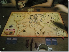
riskIn Brent Schlenker’s recent webinar, he started exploring the  concept of a “learning campaign.”  (Brent acknowledges that this isn’t necessarily a ‘new’ idea).

In the comments on my post on Brent’s talk, Steve Flowers suggests how he has been doing this in his workplace.  He calls it a ‘layered strategy’.  He says,

We stopped thinking 'this product' and started thinking 'bigger'. We built in things like message posters, and constructed brief PSA's that echoed some well shaped messages that could be reused throughout the organization for consistency. This was a concerted effort to carry the message. It's a campaign.

Julie Dirksen also provided some great ideas on how to create a campaign, including before, during and after activities.

So is it a learning campaign or a max strategy?  Either way are you doing it at your organization?  How?

Photo credit:  Risk! by junkmonkey