Showing posts with label mobile. Show all posts

Tuesday, April 24, 2012

Chad Udell on Tools for Mobile Development (#ASTDLN)

Chad Udell (@visualrinse) of Float Learning is doing a quick rundown of tools he uses to help design, manage and build mobile projects.  This is day two of the ASTD Learn Now conference in San Francisco.


UI Stencils http://www.uistencils.com/ Use these templates and tools for rapid prototypes that are to scale for the device you're building to...


Project management tools like basecamp, assembla http://www.assembla.com/


Prototyping tools

  • Fieldtest - web based tool to create fast mobile prototypes. http://fieldtestapp.com/ (focused on smartphones and up = android, iOS, windows mobile)
    Chad shares a prorotype he created that you go checkout:  http://fldt.st/10d1c7f
  • App cooker http://appcooker.com/ An ipad app for building iphone and ipad apps (very meta) $25...
Once we've got the design prototypes...the tools to build the application:
Chad cannot recommend any of the rapid learning tools for dedicated mobile development.  

"Anything that's out there now, is not doing it well.  if you want to build high quality mobile learning apps, you have to use dedicated mobile tooling."

HTML, CSS, and learn some basic design for user experiences for mobile.

jQuery mobile  http://jquerymobile.com/ It's just like webdesign. Dreamweaver has this stuff built in for the newer versions.
(And Chad exhorts everyone to stop being scared of HTML - it's just an outline -- it's not programming!)

PhoneGap -- http://phonegap.com/ the only open source mobile framework that supports platforms.  Helps you bundle up content to an app that's distributable to a marketplace (android, apple, etc.) Adobe purchased phonegap and is building it into all of their tooling.


Misconception that apps have to go through the app store.  Apperian...helps you avoid putting proprietary content into the App store. www.apperian.com

Sunday, November 06, 2011

Tom Crawford: Design for Mobile The Ups and Downs of the Small Screen #devlearn @vizchef

My live blogged notes from Tom Crawford, @vizchef, @viznetwork session at DevLearn November 3, 2011 in Las Vegas.  Forgive the typos and omissions. And also forgive the delay – forgot to publish these right after the session on Thursday!

The mobile market:

Smart phones are growing; but not-smart-phones are still significant part of the market. So you could still do SMS and text and do good stuff with mobile learning. Today we’ll talk about smart phones.

Androids are growing.

PC/laptop use is down 20%; mobile is 30% up.

The better numbers are about actual users – Yelp has 45 million users. right now only 7% of them are mobile, but 35% of searches are done on mobile.

Facebook – mobile users are 2x as active as desktop users (they post more, read more, are online longer)

Eight unique affordances of mobile:

  1. personal – the phone knows a lot about you – where you walked. it knows things you didn’t tell it.
  2. always carried (in the room EVERYONE has their phone, but most of them don’t have their laptop)
  3. always on
  4. built-in payments
  5. available when inspired (you have an idea or thought, you do it right then)
  6. accurate audience measures (incredible data – everything is tracked – when, where you sent that text; when you went online. That kind of tracking data is not available anywhere else.)
  7. captures context (you know where they are)
  8. allows augmented reality

Native Apps vs. Web Apps

native is written for a specific device.

You have to make this decision.

native apps run faster, more interesting, access more controls on the phone. However, then you have to develop for iphone, ipod, android, etc…takes a lot of time and money.
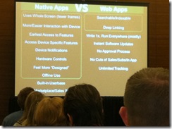
photo (5)

Web app runs on everything that has a web browser. Develop once and run everywhere. But doesn’t run well always and not fully featured.

Cross platform tools – unity mobile, unity, appcelerator…publish to one place and deliver to multiple devices.

Go to The Boston Globe website – the website resizes; images resizes or disappear depending on the device used.  Program once and run on all devices. (they’re using a new design style – html5 and css with some javascript; also some intelligence behind it). If you’re thinking about doing mobile web apps – check out that site.

Getting started: benchmark

Look at best in class apps out there – what affordances? Flight Track Pro, SoundHound, Angry Birds, NetFlix,

Getting started: know your audience

No different from any other design. “You are not your audience”

Mobile Context – where are people using their devices? What environment are they in? Context is really important…

Are they using this on a sales call, at their desk, in a line, in a car? 

If they’ll need it fast – one big button.

Design

Prepare for lots of tips..

use basic design

  • no design is perfect – you can always tweak it
  • every design has compromises, trade-offs and constraints – we have to make choices
  • criteria for “good” design depends (LukeW calls this sharks climbing trees – in the water sharks are amazing)
  • no one right answer
  • no just about look, but about FEEL (does it feel responsive, like you’re learning?)

steal like an artist nothing is original – find good stuff and use it…

Content first (don’t make me login first – foodspotting – you can go find stuff immediately, you only login when you want to ask questions or upload photos, etc. get me what i need now – if i’m standing in line, get me my content otherwise by the time i’m done logging in i’m done with my line)

only ask for data/info WHEN you need it

Disappearing UI As a % of space – use it for content – minimize navigation, etc. Put content upfront and center. You can hide nav until you need it.

Edit, edit, edit cut the content to the essentials

Minimize the steps

Billboard/glance test can you look at it and get it? (period tracker app, compass app – tells you where your partner is)  Billboard test – you’re going down the higway and you have 3 seconds to get it…

Clarity trumps density too much info on a screen? wasted space?

The rule of 44 your fingertip takes up about 44 x 44 pixels – buttons should fit that space (or the tap area needs to be that space). Or make it even bigger so they don’t have to think – make a giant button.

Design to a grid every object on the screen should be aligned to another object on the screen

Follow reading order in US we follow z reading order – prioritize your content

Tasteful, understated not garish

Avoid metaphor you’ve got small space, don’t waste it with interface that is bling. Content first.

Balance brands & standards follow apple standards for ios apps.

Don’t just say “Back” don’t know where i’m going back to.  instead have the back arrow with text -- “full title” or “title” or “full ti…” Tell them where they’re going back to.

Follow title bar zones for apple apps follow standards. have your logo on the front page, but don’t put it on every page (netflix wastes space with their title on every page)

Don’t be too clever he shows some bathroom signs that are clever but who knows which is men’s or women’s…

Use clear standard icons

Use a consistent light source for graphics etc – you won’t know why you won’t like an app that does this, but you will

1-2 Fonts; 4 sizes nothing more and use them consistently to mean the same thing

Use visual cues like grouping

Tap zones if you’re holding your phone in your left hand there’s a zone you can reach with one hand…you can’t reach the top corner…

Use the right keyboard number, letters, etc…

Use the right capitalization make no caps

Make the form disappear  TripIt is a good example. Get your flight info from delta and forward it to tripit and it pulls it all out for you. Type nothing.

Avoid scrolling where possible If you’re going to scroll, make it obvious


Beyond touch

lots of sensors now – voice, gestures, proximity, bluetooth, gps, compass, cameras, accelerometer, shake…

Augmented reality

overlay of data knowledge on an image…new employee orientation…

What was there (an app) – see what was there 100 years ago…

Word lens – live translation – while you point your camera at a sign it translates it…

Prototype & Test

Balsamiq – great prototyping tool which you can actually run on the phone. super simple way to test

“A good UI without a good UX is meaningless (and vice versa)”  -- if beautiful design doesn’t work or if it works and it’s ugly…

Resources

  • Tapworthy
  • Desigining the iphone User Experience
  • Designing Mobile Interfaces
  • Designing for Emotion
  • Mobile First

Tuesday, October 11, 2011

Instructional Design for Mobile Learning #id4mlearning

These are my live blogged notes from a webinar today with Float Learning: Instructional Design for Mobile #id4mlearning. Advance apologies for typos or incoherence…

Brought to us today by:

  • Adam Bockler, Float
  • Gary Woodill, Sr. Analyst at Float @gwoodill
  • Jeff Tillet mLearning Strategist and Evangelist at Float (formerly ID at T-mobile) @mojotillett
  • Chad Udell at Float @visualrinse

www.floatlearning.com 18 month old company with focus on mobile. @floatlearning

Agenda: conversation points

  • Where we came from
  • Where we are at?
  • Where’s it going?

Resources:

  • Gary Woodill’s The Mobile Learning Edge
  • Clark Quinn, Designing mLearning
  • Barbara Ballard, Designing the Mobile User Experience

(We can tell a field is about to take off because there’s a big rash of books!)

What is instruction?

It’s a two way street.  But instruction tends to not be an equal relationship – there’s a power differential.

What makes good instruction is often a willing student.

So often people treat ID as just organizing information on a page.

A Brief History of Instruction

The modern classroom, 1770’s in Prussia – you faced the teacher who was the expert and the storehouse of knowledge.

Same metaphor applies to a lot of elearning – starting at a screen = staring at a teacher.

“Classrooms immobilized us…mobile devices now mobilizes us.”

We can use devices in the classroom to mobilize us – get kids out from behind their desks and moving around, gathering information.

Mobile learning starts to encourage diversity in learning (as opposed to traditional classroom which encourages conformity.)

Nowadays, there’s just way too much information.  Teachers can’t keep up.  In the workforce it’s overwhelming. 

The “just in case” model of learning isn’t very efficient. Now I need it where I need it and when I need it.

Moving from competency based learning to task based learning. Now learning according to what the task at hand is.

The last 50 years of ID

  • Behaviorism (very simple, little bits) and Programmed Instruction. 1940s
  • Bloom’s Taxonomy 1956
  • Mager Learning Objectives 1962
  • Gagne 9 Events 1965
  • ADDIE…1975
  • ADDIE and the 5 Rules of Zen 2002

The affordances of mobile devices are many – need to think about training and ID in new ways.

Growth of the Corporate University movement (represented a shift from hallway training and apprentice movement) – the increasing professionalization of training – and now we’re getting ready to move away from it. (We’ve tried to fit adults into this classroom model – shows a picture of some elderly gents looking uncomfortable whilst staring at the front of a classroom).

We’re not dismissing those old ways of learning – we’re finding additional ways.

We’ve tried to use all these old school metaphors (e.g., raise your hand while interacting with a CD ROM).

Technology Advancements: Here’s what’s changed…

  • Computers
  • Internet
  • Gaming & Interactive
  • Social or Informal

Use these tools/strategies/realities – differently.

Gamification and “Engagification”

"Bad ID with badges is still bad ID. Bad ID with badges is still bad ID."  (Chad Udell @visualrinse)

Saatchi and Saatchi study on gamification: http://www.slideshare.net/Saatchi_S/gamification-study

Here's a great presentation on the use of gamification and how it still needs an emotional aspect in order to be effective: http://www.slideshare.net/avantgame/we-dont-need-no-stinkin-badges-how-to-reinvent-reality-without-gamification

Augmented Reality

Take a picture of an environment and text labels appear in the picture. Or add images/objects onto the environment…

http://www.youtube.com/watch?v=gdlqtLVdTpw&feature=youtu.be&t=26s

http://floatlearning.com/2010/12/just-in-time-learning/

Is it performance support?

Some of the new things around mobile:

Physically, we learn better when there’s blood moving around – when we’re mobile. http://www.brainrules.net/

If you’re moving around and in the environment, you’re in context.  This may spark the need to learn more about something (e.g., if you’re in Venice, you want to learn more about Venice)

A brief history of Mobile Learning

Clark Quinn – early definition of mobile learning in 2001

Europe has done more around mobile

Commercial side starting to develop (e.g., mobile focused vendors like Float)

Four Conventional Learning Applications for Mobile Devices

  1. Instructional support uses (elearning on a small screen – lectures, video, audio clips, notes)
  2. Personal Organizers
  3. Learning Management Systems on a mobile
  4. Assessments

New Learning Application Categories

1. microblogging and text messaging “social media” (see: http://www.twitip.com/twitter-the-real-time-answer-engine/)

2. Research tool – data collection (go out into the environment and track things, collect data, then bring it back to the classroom for discussion)

3. Trend tracking and analysis

4. just in time information retrieval (Alerts go out when a bakery takes fresh bread out of the oven.  )

5. augmented reality

6. mobile gaming and virtual words (gamification…)

7. contextual learning – personalization and location (you know the person, where they’re located, what their needs and habits are and what they need at a certain place)

8. user controlled media/production/playback (use your personal devices for your own productions - “looking from the bottom up”)

9. performance support and coaching

10. Social networking and communities

11. environmental controls

12. haptic feedback

13. first person documentation

14. coordination and cooperation

15. collaboration

16. collective behavior…

“Unplanned learning. Do we have to plan all the ways that people learn? Maybe we relax…and lose control.” IDs in the mobile world

“We learn a lot from our peers – back to the apprenticeship model.”

So what does Float do?

www.floatlearning.com/blog

  • Basic research and strategies
  • Analysis on what’s going on within your companies
  • Prototyping and building solutions

Thursday, April 14, 2011

Clark Quinn on Designing Mobile Learning (Audio Interview)

Mobile Learning – seems to finally be tipping. 

If you’re involved with training, I suspect the push for providing mobile solutions is getting stronger.  Companies are starting to distribute iPads to their sales teams; practically everyone in corporate has a smart phone now.   

If you’re an Instructional Designer and freaking out that now you have to do mobile too – on top of everything else?! – let’s just calm down….

Start by listening to my recent interview with Clark Quinn. 

dmbooktitleAnd then be sure to pick up Clark’s newest book: Designing mLearning: Tapping into the mobile revolution for organizational performance. 

Listen to the audio interview: Designing mLearning with Clark Quinn

Monday, February 21, 2011

Clark Quinn: Designing mLearning

With lots on my reading list, Clark Quinn's latest book Designing mLearning: Tapping into the Mobile Revolution for Organizational Performance is on the top of the pile.

Client's are starting to ask, we're starting to tinker. Get ahead of the curve and actually figure out what you need to be designing.

That's my plan. I really don't want to get caught with my proverbial pants down...